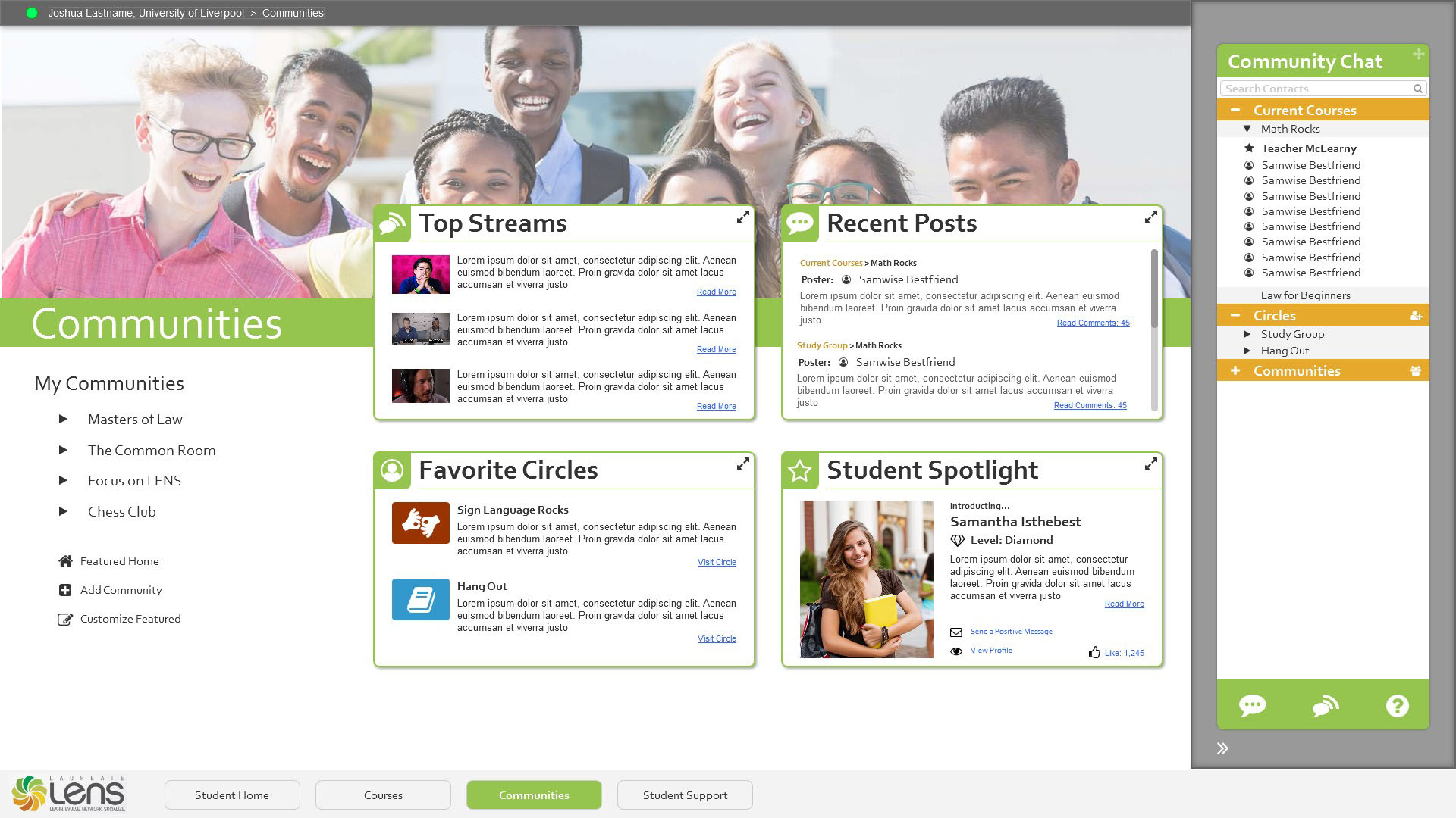
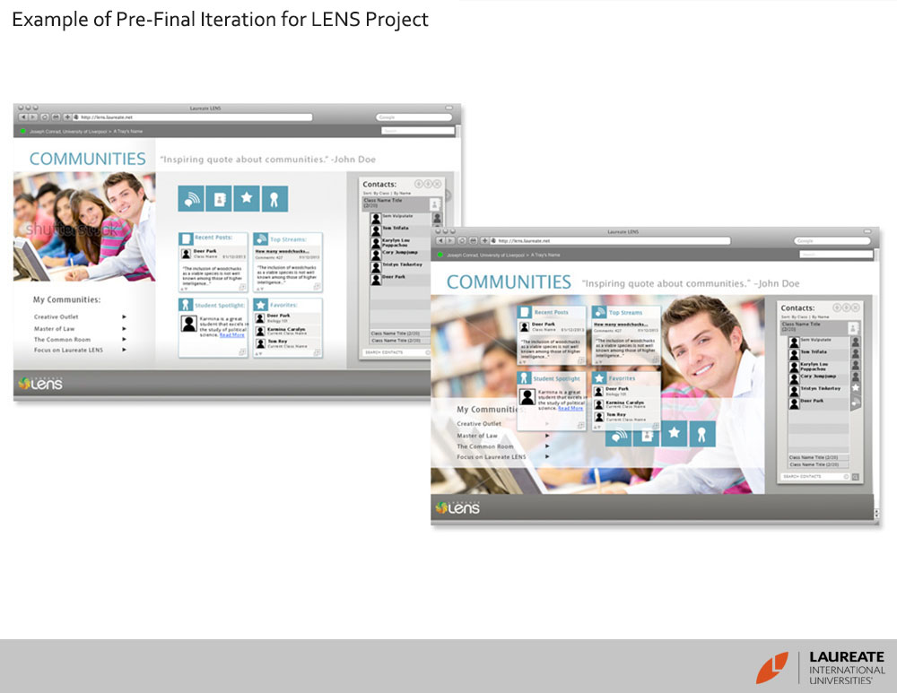
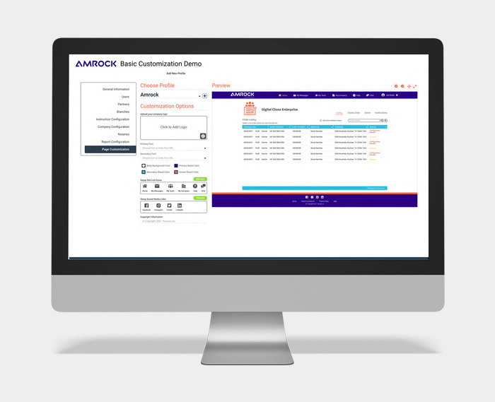
What I Have Been Working On
"Where science meets creativity!"
HEWLETT PACKARD ENT.
Includes Case Study
CACI
Includes Case Study
WIN REALITY
Includes Case Study
RAM QUEST
DATA VISUALS
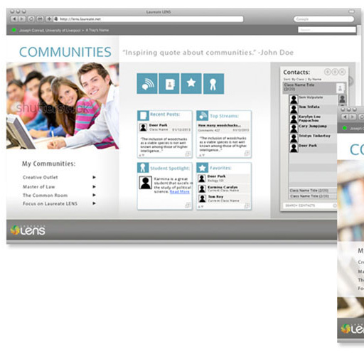
LAUREATE
Other Projects
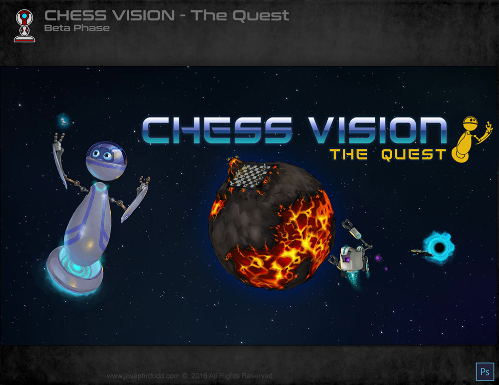
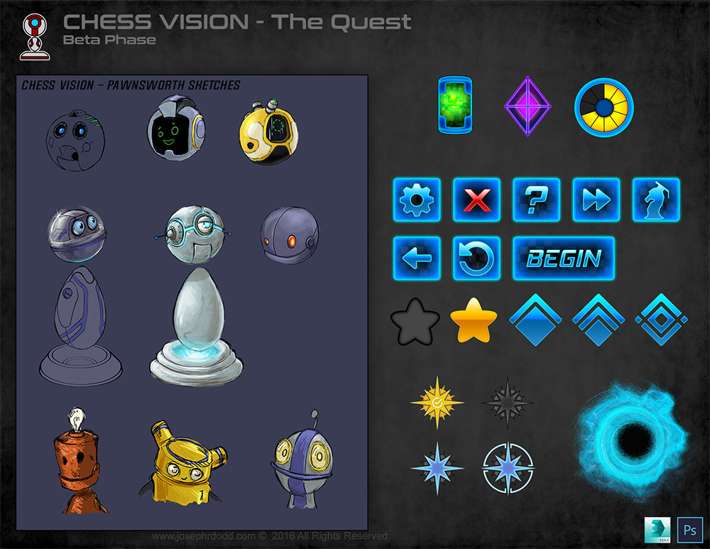
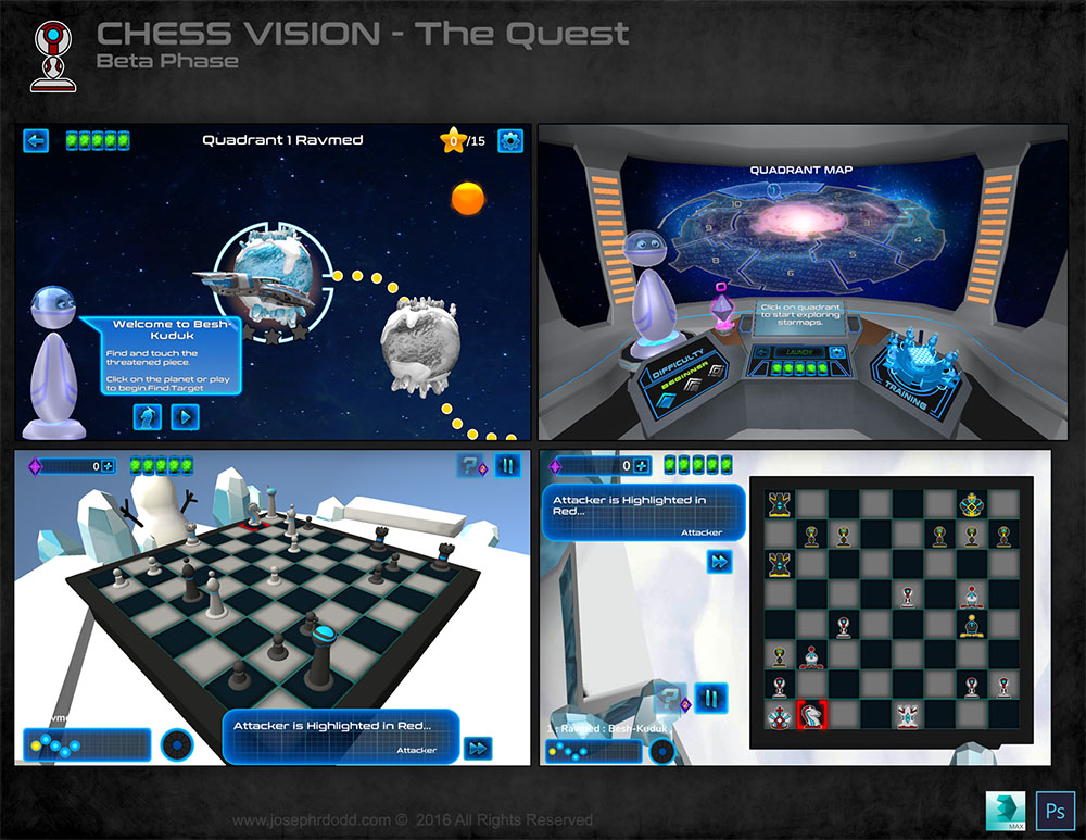
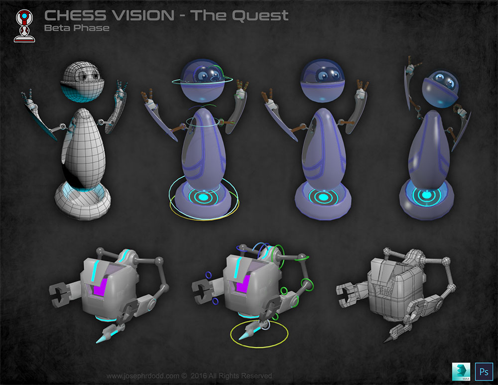
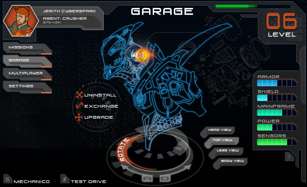
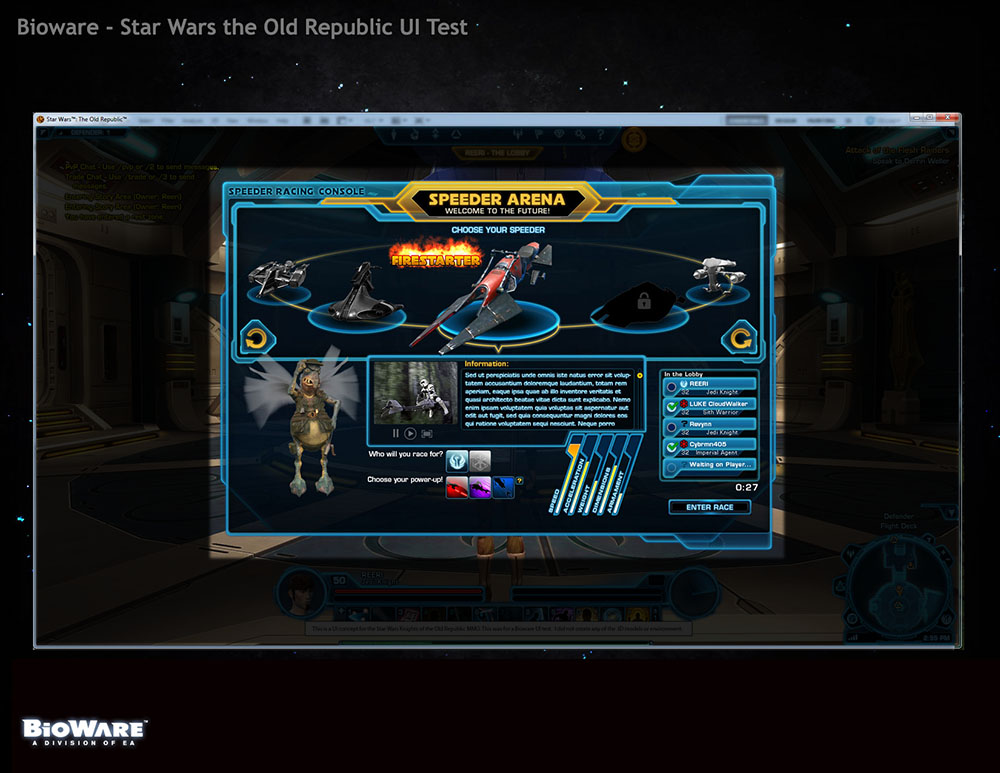
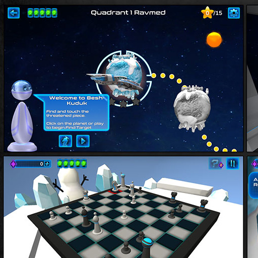
Chess Vision
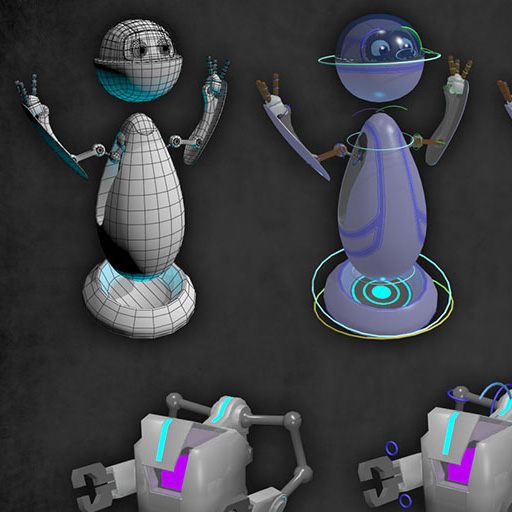
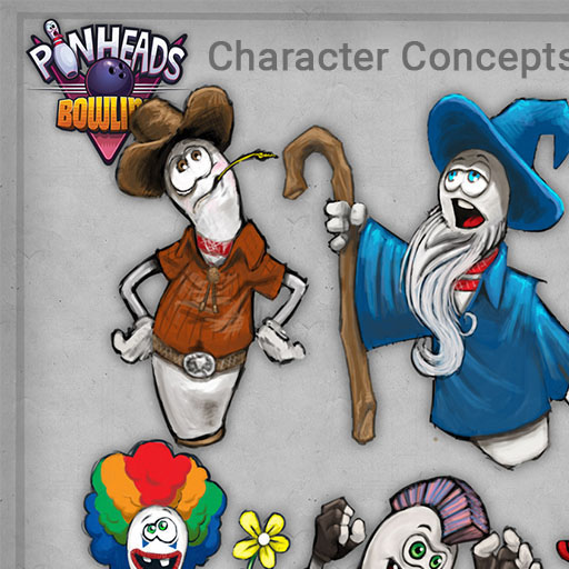
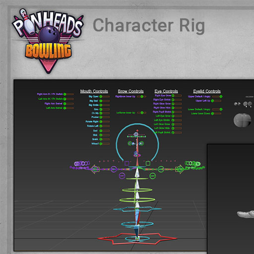
Pinheads
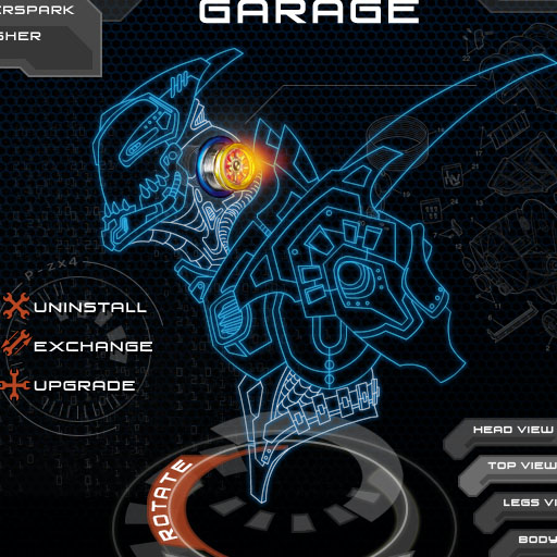
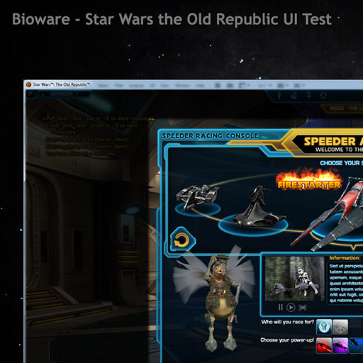
Other UI
Typography
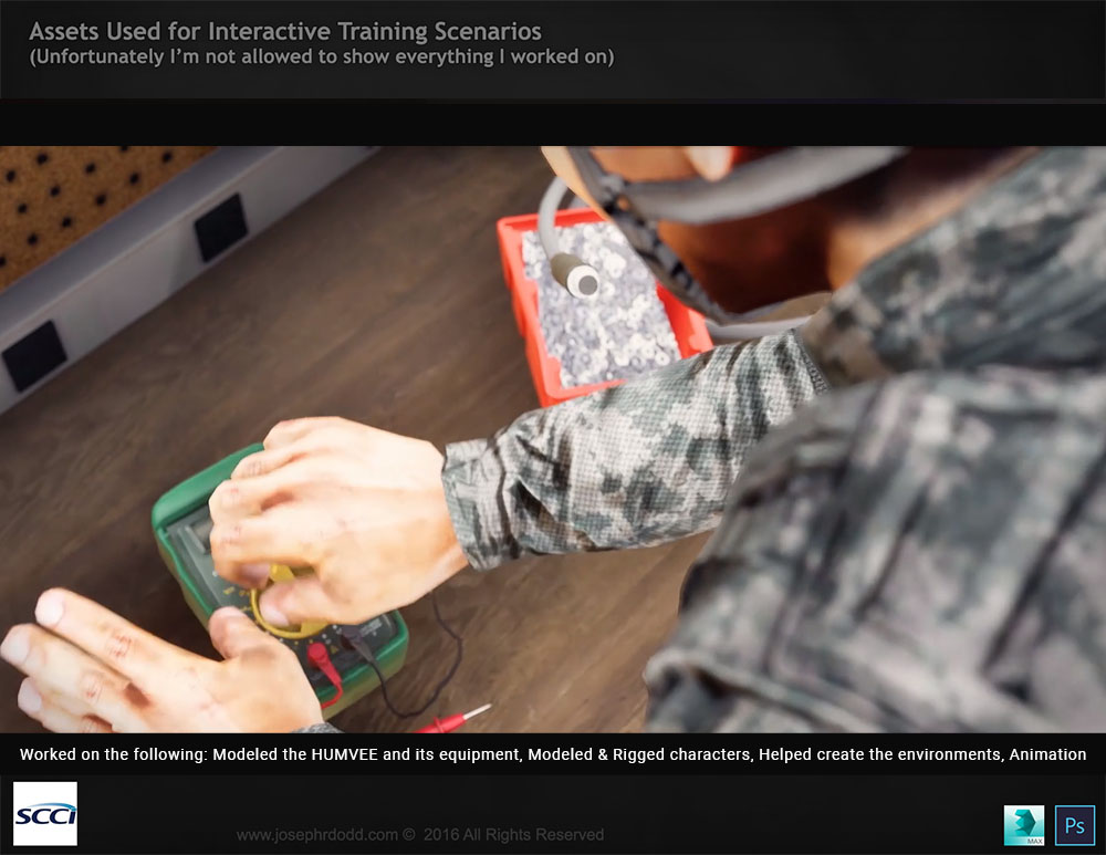
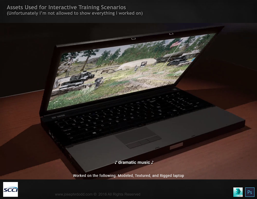
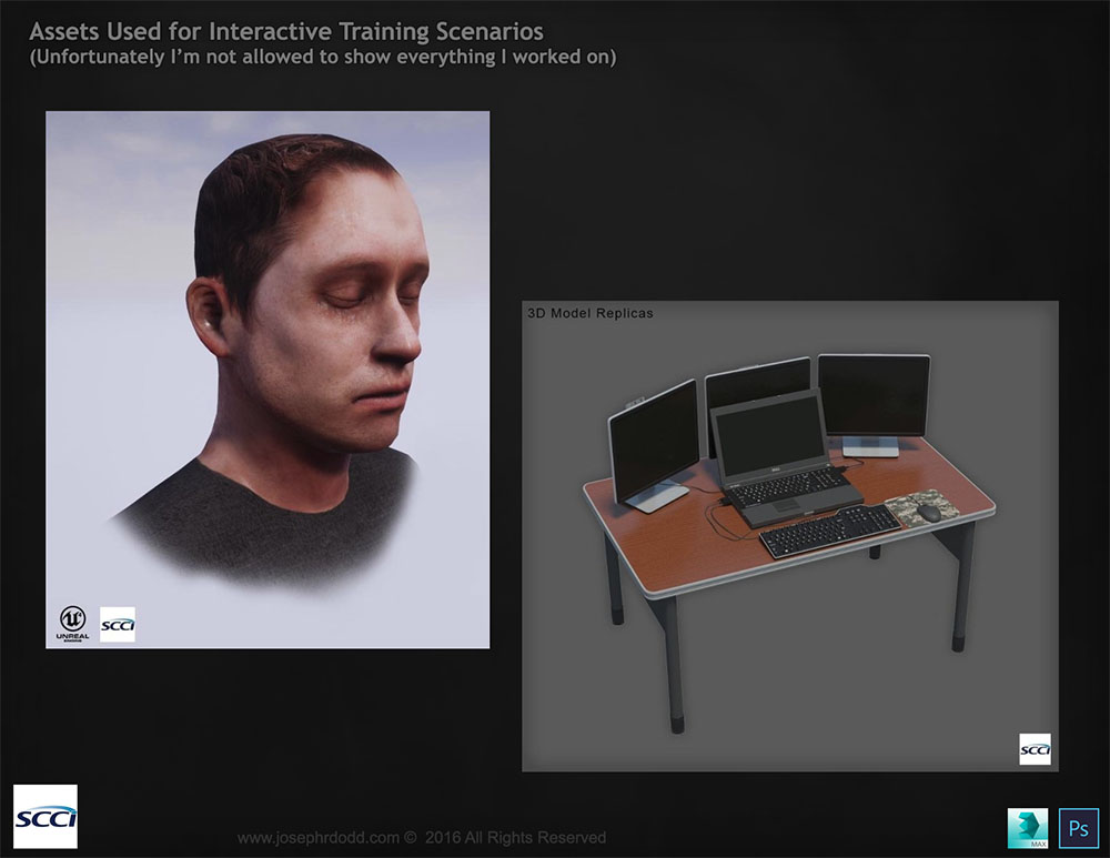
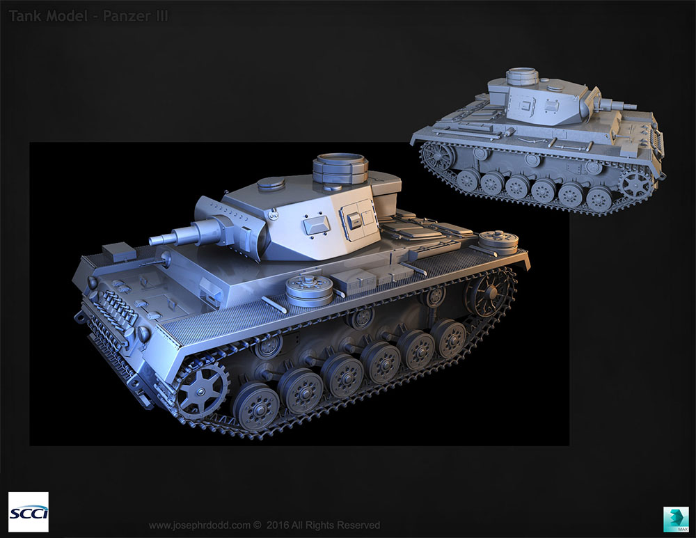
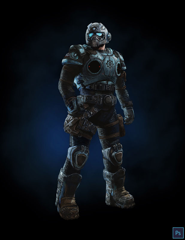
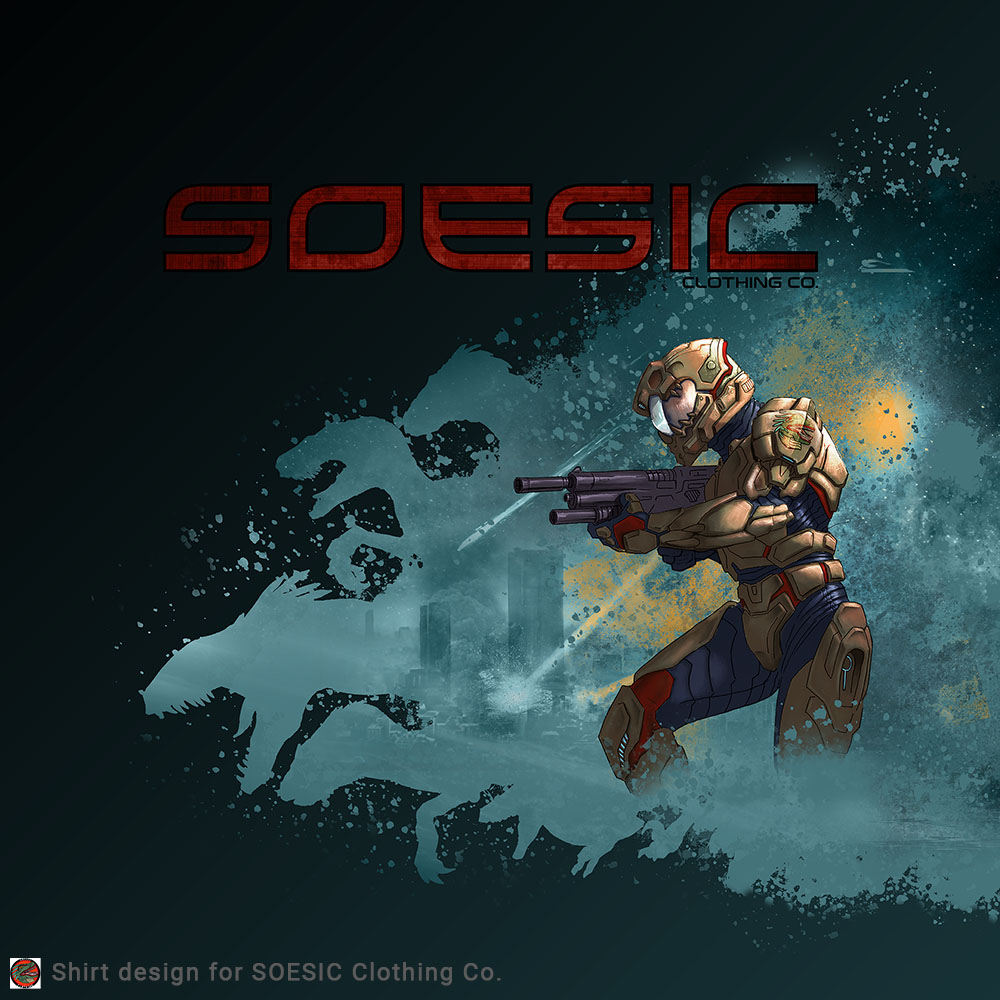
SCCI
Digital Paint
Other Projects
Chess Vision
Pinheads
Other UI
Typography
SCCI
Digital Paint
HEWLETT PACKARD ENTERPRISE
Case Study
Programs
- Figma
- Confluence
- Whiteboards
- Pattern Library
- Style Guide
- Research Team
Skills
- UX Design Thinking
- Research
- UI/UX Design
- Visual & Interaction
- Enterprise Level
- Leadership, Teamwork
- Cross-Org
- Cross-Team
HEWLETT PACKARD ENTERPRISE
Case Study
Programs
- Figma
- Confluence
- Whiteboards
- Pattern Library
- Style Guide
- Research Team
Skills
- UX Design Thinking
- Research
- UI/UX Design
- Visual & Interaction
- Enterprise Level
- Leadership, Teamwork
- Cross-Org
- Cross-Team

File Storage
Includes Case Study

Storage Fabric Mgmt

Sustainability
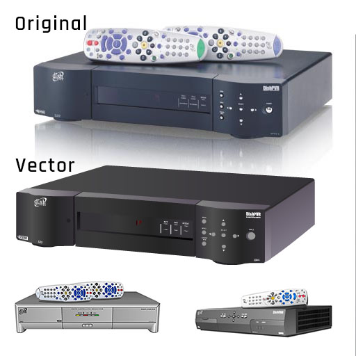
Hardware Vectors
PROJECT BACKGROUND
See a Need, Fill a Need
Bigshot Medical is grappling with the complexities of managing an overwhelming amount of data—potentially exceeding 50 petabytes annually. Currently, they find themselves mired in infrastructure silos, plagued by performance bottlenecks, and burdened by a tangle of disparate programs that struggle to communicate effectively. The result? Low productivity and significant operational inefficiencies.
What Bigshot Medical truly needs is a seamless solution for storing and sharing unstructured data. While structured data is neatly organized, unstructured data is inherently chaotic and rapidly generated, making it difficult to manage but incredibly valuable. By simplifying the storage and sharing of this unstructured data, Bigshot Medical can unlock its potential for future analysis and classification, ultimately transforming a challenge into a strategic advantage.

Feature photo licensed under HPE
What is the Answer?
- Cloud Everywhere Experience
- One Infrastructure for Workloads
- Max Performance Scalability
- Expedited Job Setup & Completion
- Cost Effective
Project Role
- For this project, I was the design owner and Senior Interactive Designer.
- Reviewed current pain points, tech documents, and preliminary research for proposed File Storage product.
- Researched similar products for what is currently working, what isn’t working and new trends.
- Mediator between Development and Design.
- Contributed to Pattern Library and Visuals with updated, or new use-cases depending on the needs of the project.
- Helped to finalize the best process for this project and how to best work with developers.
- Weekly meetings, Jira for task tracking, Confluence for product details and data tracking.
- Used Figma to develop visual information architecture, feature specific flow-charts, wireframes.
- Developed prototypes for review and testing.
- Investigated Problems and Provided Solutions.
Who I Worked With
- Visual/Pattern Team provided style guide and current approved components
- Development Team (Lead Architect, Tech Lead, Engineers)
- Received Heavy Tech Documentation
- Project Managers
- Collaborated with other design team members for reviews and consistency use-cases

Feature photo licensed under HPE
What is File Storage
- Simplified Data Management
- Enterprise-Level Performance
- Intuitive and Scalable
- Cloud SaaS
- Empowering
- Rich Data Services
- Faster Insight
- Innovative
- Competitive Advantage
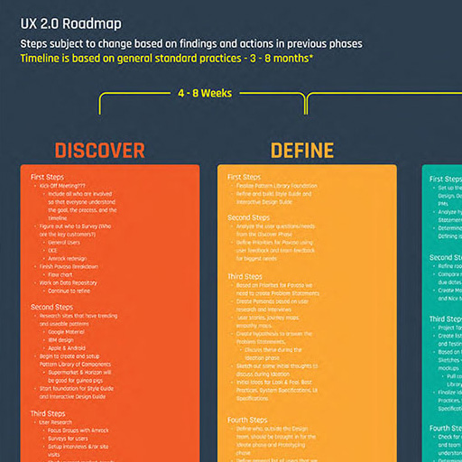
DISCOVERY & IDEATION
Understanding the user for File Storage is to fully understand how they can accomplish their data management from beginning to end.
User examples consisted of IT Users, IT Directors, Line of Business Owners, and Data Scientist.
To effectively provide for their needs I focused on thoroughly reading all the documentation available within the company about our user’s needs, pain points, and life constraints. This includes factors like attention span, time management, confusing industry jargon, and the pressure from the company to deliver results.

See the Hardware section for more of these
Expanding Horizons
Part of my process, includes learning about different domains. For File Storage this involves managing physical devices. My research includes learning about servers, functionalities, key metrics, computer networking, and data protection.
Having an honest conversations with product managers, developers, and software architects during the design process is key to successfully working together and achieving design success.
The discussions helped me to understand their perspectives and the various technical challenges they had with the project.
This also helped to prioritize the functional needs and make trade-offs to meet deadlines without compromising the user experience.

See the Hardware section for more of these
Requirements
- HPE Greenlake Product
- Edge-to-Cloud Platform ™
- Simplified Data Management
- Cloud Operation Experience
- Create and Share Files from Anywhere
- Local and Remote Protection
- Works with Data Ops Manager
- Edge-to-Cloud Platform ™
- Capacity and Quota Management
- User and Group Management
- Web Browser Implementation
Requirements
- Next Generation Business and AI
- Performance Review, Metrics
- Performance Management
- Keep Track of Issues, Announcements
- Tasks Management
- Hardware Management
- Local Centralized Collaboration
- Audit Support for Service Operations
- Must be able to work with VAST
- Must be able to work with Data Ops Manager
- Must be able to work with Task Manager
Requirements
- HPE Greenlake Product
- Edge-to-Cloud Platform ™
- Simplified Data Management
- Cloud Operation Experience
- Create and Share Files from Anywhere
- Local and Remote Protection
- Works with Data Ops Manager
- Edge-to-Cloud Platform ™
- Capacity and Quota Management
- User and Group Management
- Web Browser Implementation
- Next Generation Business and AI
- Performance Review, Metrics
- Performance Management
- Keep Track of Issues, Announcements
- Tasks Management
- Hardware Management
- Local Centralized Collaboration
- Audit Support for Service Operations
- Must be able to work with VAST
- Must be able to work with Data Ops Manager
- Must be able to work with Task Manager
Is File Storage Complex to Use?
I designed File to lead without controlling. More of like an assistant that is really good with directions and understanding your needs.
As a new user, File Storage will help you with any task that needs to be done. Whether it is creating your first Cluster (Server) or your first File Share. There will be easy access to any setup Wizard.
If you need a server, File will help you set one up. If you see an empty Dashboard or List Page then you will be directed, through prompts and easy to understand directions, to set up a File Share to hold your data.
Once I had a comprehensive understanding of the problem we were trying to solve and the technical constraints that we were facing I was able to effectively start the creative process.
This process involves sketching, graphs, analyzing different outcomes and interactions that can lead the user to do their jobs.
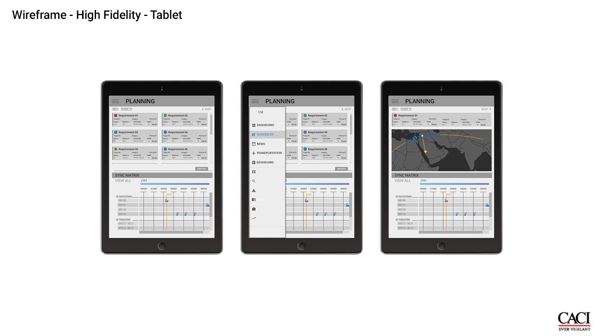
Example Figma Wireframe
Here is example information architecture & wireframe.

Solutions to Deliver
- Create Effective Features for Productivity and Faster Insight
- Support Dynamic Pages and Interactions
- File Shares are Most Important and will hold Managed Data
- Allow for Ability to Create and Customize
- Provide a Single Pane of Glass Experience
- Provide Expedited Job Setup and Completion
- Allow for Ability to Scale Performance and Capacity Independently
- What sort of Data Interactions are needed?
- Designed for integration with VAST and other applications
- This helped to enhance the application’s functionality
- Aided in solidifying the user experience
PROBLEMS & SOLUTIONS
Problem Description
Users have a lot of data they need work, some even work on an exabyte scale of data! Complex data needs tend to lead to complex programs that require a large learning curve and too many clicks and digging to achieve success.
Not to mention that many of our users are used to having to involve multiple technologies that involve relational databases, datastores, streams, processors, etc.
A level of careful consideration must be taken to understand the scalability, reliability, consistency, efficiency, and maintainability.
Challenges
- Data encoding and decoding ambiguity
- Robust strategies required for growth and scalability
- Reliable and fault-tolerant systems
Strategies
- Use a standardized and consistent encoding
- Flexible programming models that hide the complexity but deliver ease-of-use to the user
- Design with resilience, long-term, using techniques like distributed storage and computing
- Data Parallelism
- Choose the right framework to support data-intensive computing
- Lower the entry barriers but still have high security and trust
Design Solution Examples
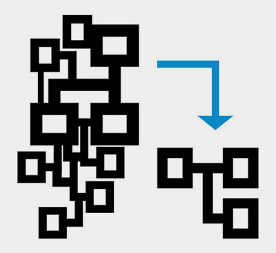
Using the information hierarchy, it helped to simplify the complex data. I was able to design an easily navigated system that makes sense of large databases and datasets.
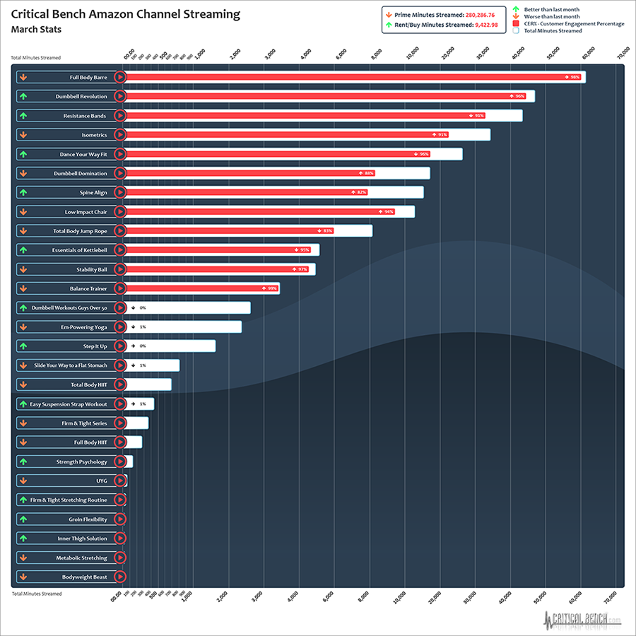
The determined best mode of representation for data was to use a combination of charts, tables, maps, or other visualizations to effectively convey complex information. You will see this shown visually in the examples I have provided.
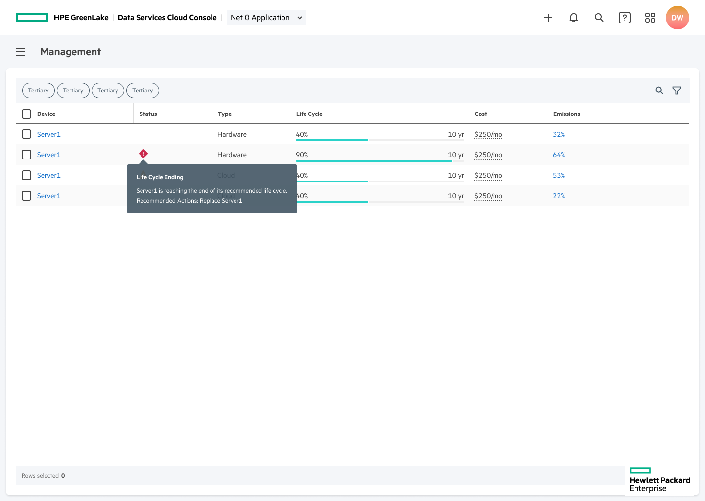
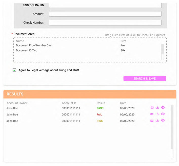
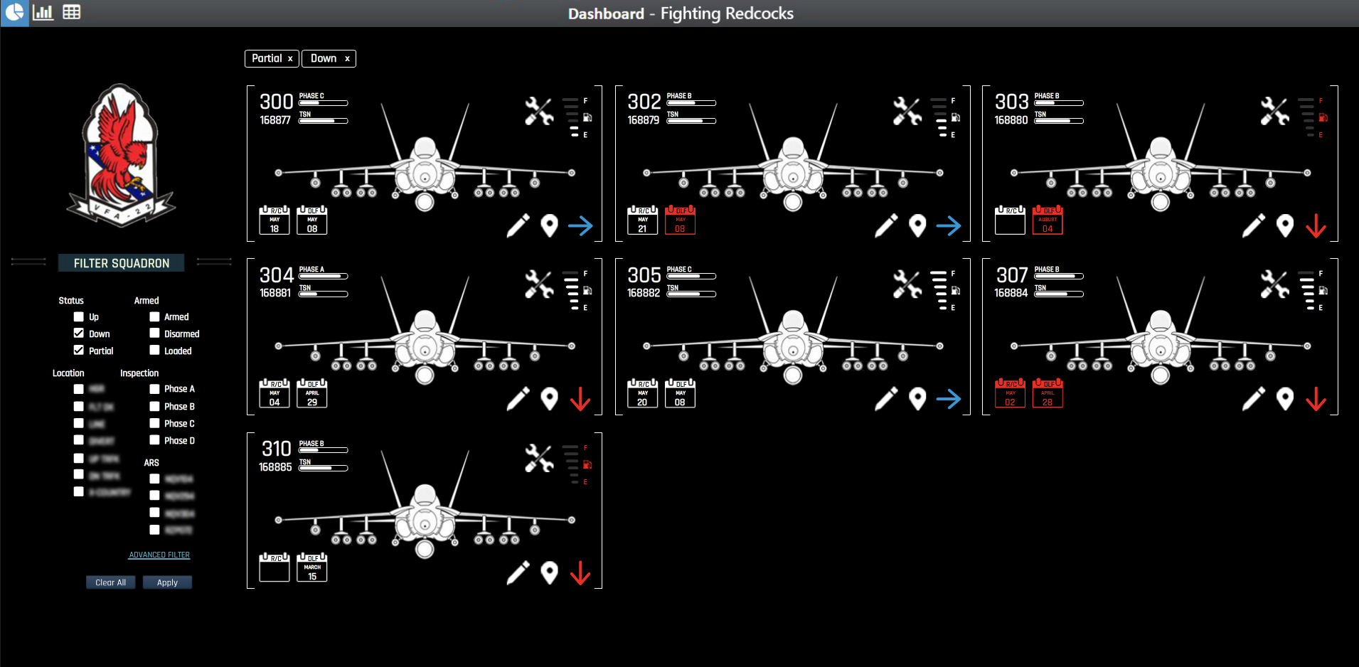
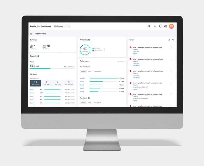
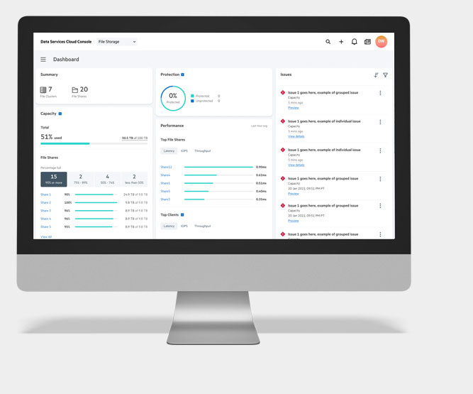
The dashboard example below prioritizes surfacing relevant information that can give users an overall status of their File Shares, Protection, Health, and Capacity. All of these allowing for actionable interactions.
Dashboard Example
Data broken down into digestible bites allows for information and interaction to have a high level of success. This also allows for easy scalability, growth, and even customization. Starting high-level and then allowing for deeper diving as needed.
Dynamic dashboards are a great example of digestible bites. I designed the dashboard to allow for quick overviews of files or systems, performance, capacity and protection. It is customizable, scalable and provides the ability to dig deeper. This is especially helpful for users needing to check in to see if there were any pending or detrimental issues, or to get a quick summary of the state of their File Storage.

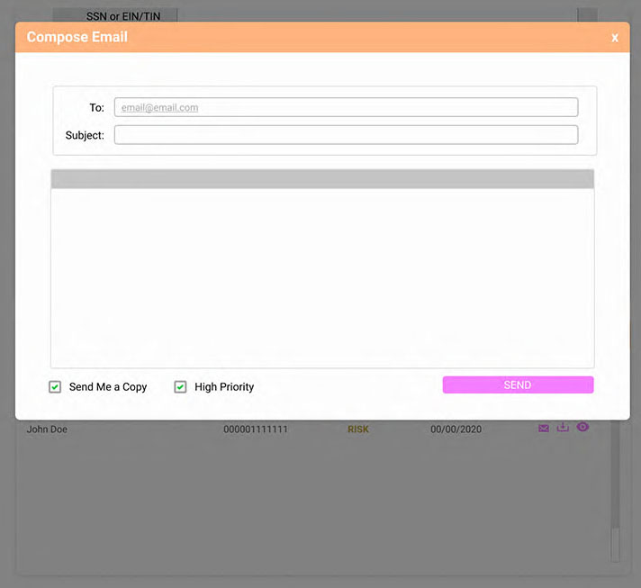
Modal Example
The choice of using wizard modals is an example of robust design that is feature focused for achieving streamlining.
Combine that with the "Sliding Modal" that I helped create, we were able to provide an "access from anywhere" solution that wasn't confined to a specific page. And just to clarify, a sliding modal is literally two modals in one that slide from side to side to allow for multiple wizards to be used during one process.
Modals are also used to help users focus on single, contained tasks inside the information architecture. This helps to keep the provided information in smaller bites, grab the users attention, and give the ability to provide additional information without having the user lose focus.

Non-marked version

Non-marked version
Problem Description
Enterprise applications often have a very intricate data flow system that makes it difficult to deliver complex information in a quick, clear and understandable way.
As a designer you also have to balance the needs of different stakeholders, multiple features, interfaces, systems, compliance with regulatory standards, varying user expectations, consistency, and security.
Challenges
- Simplify data visualization without sacrificing accuracy
- Ensure transparency & speed while maintaining confidentiality
- Scalable solutions must adapt to changing requirements
- Stay compliant with the correct regulations
- Know what users expect
- Do not compromise system integrity or security
- Enable quicker insight should not conflict with transparency
- Establish clear design patterns and standards
Strategies
- Clear and concise labeling adn direction
- Tailor visuals to clearly show data and processes
- Clear roles and permissions
- Gain clear understanding of stakeholders and user needs
- Prioritize security and system integrity
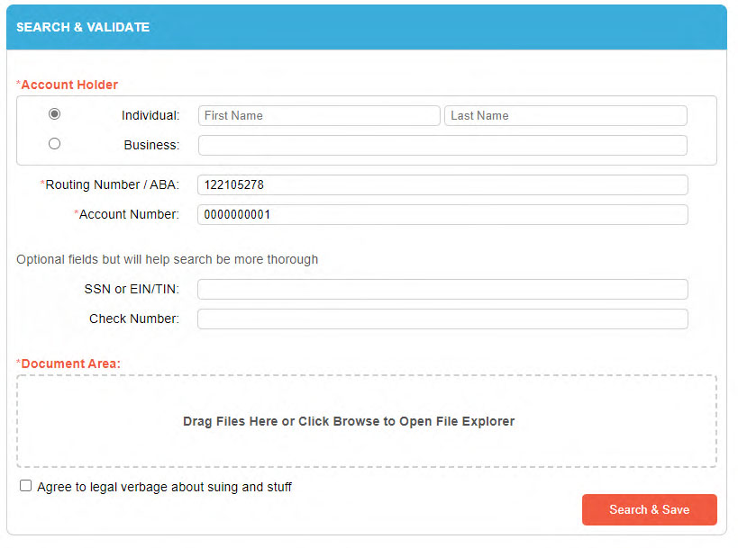
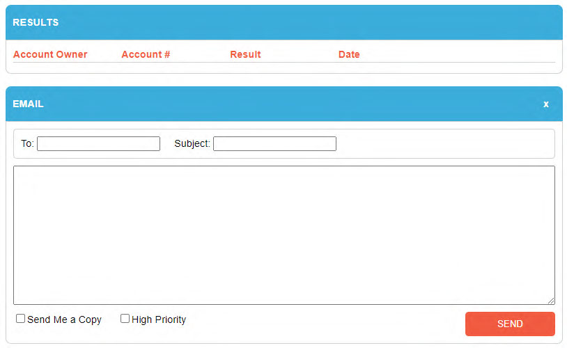
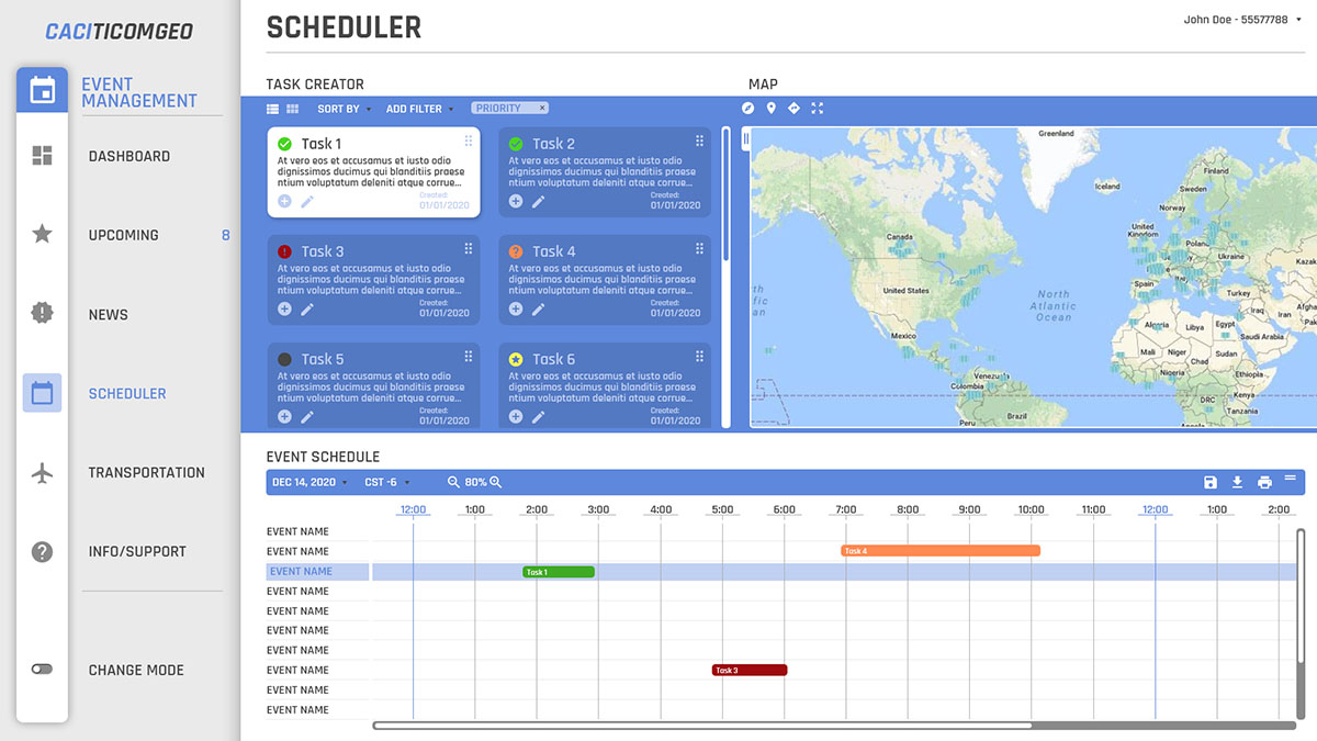
List Page Example
File Share list pages are the first place you will come to after the Dashboard. These pages allow for a summarized view that gives quick insight.
Transparency is hinted at in this page with the easy to understand performance and usage information. For even more transparency and insight, all you have to do is select one of the File Shares.
The table design helps to create a focused area to see a good number of files without being overwhelmed by a huge list. Pagination, sliding table selections, and organized by priority data all help with the ease of use, and trust that your files and systems are working as intended.
Though, if problems arise, traditionally used status icons will inform the user that there is something they need to look at. They will be able to easily address and go to to the problem area.

Details Page Example
Details Pages are a great example of transparency and quick insight.
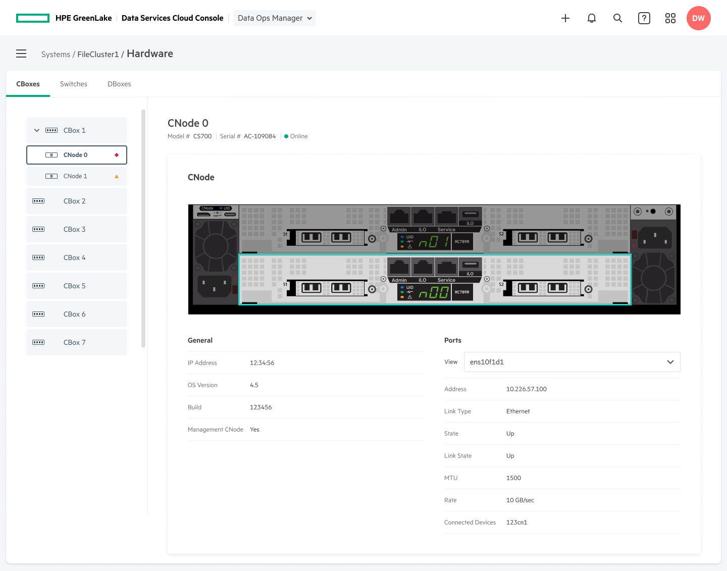
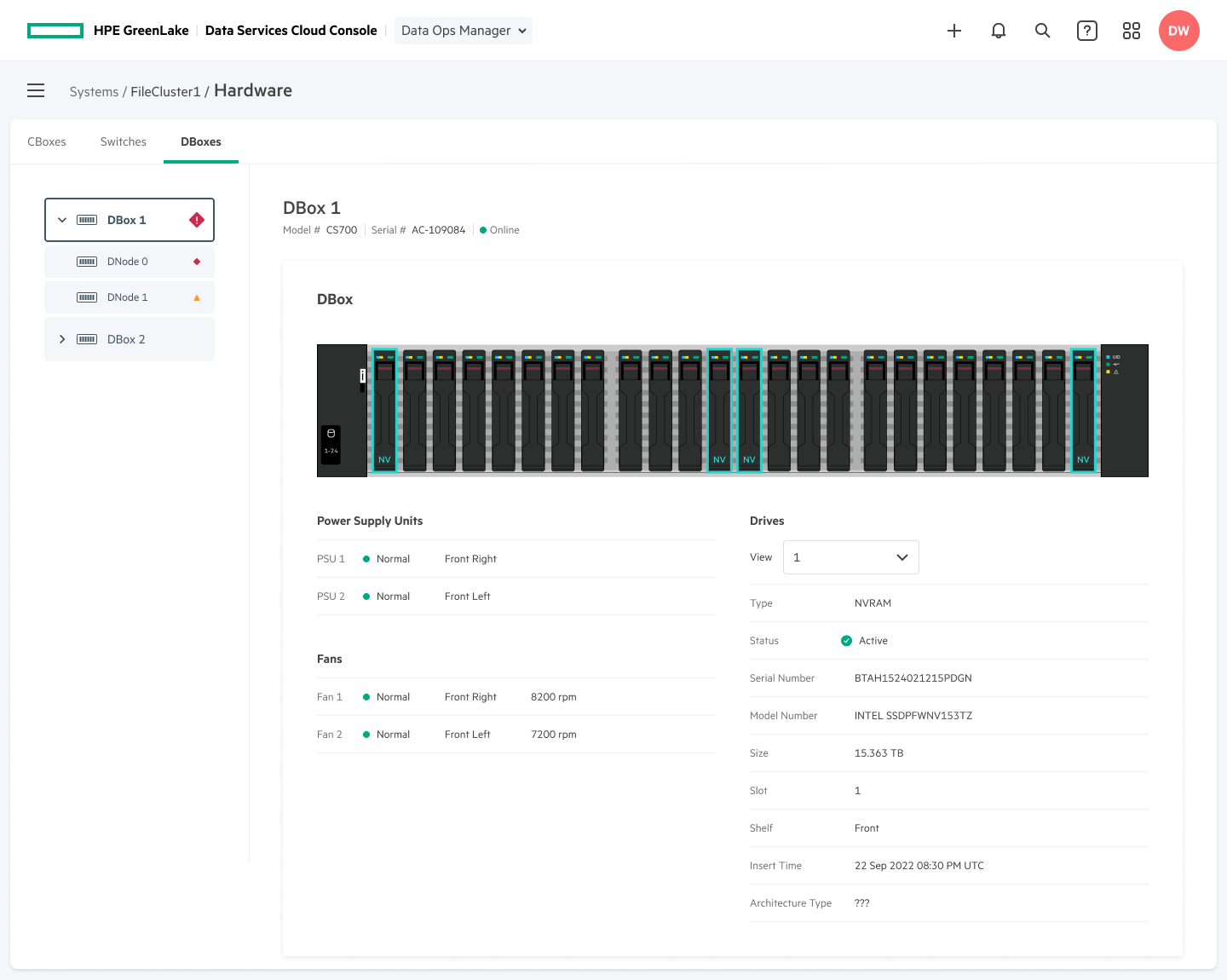
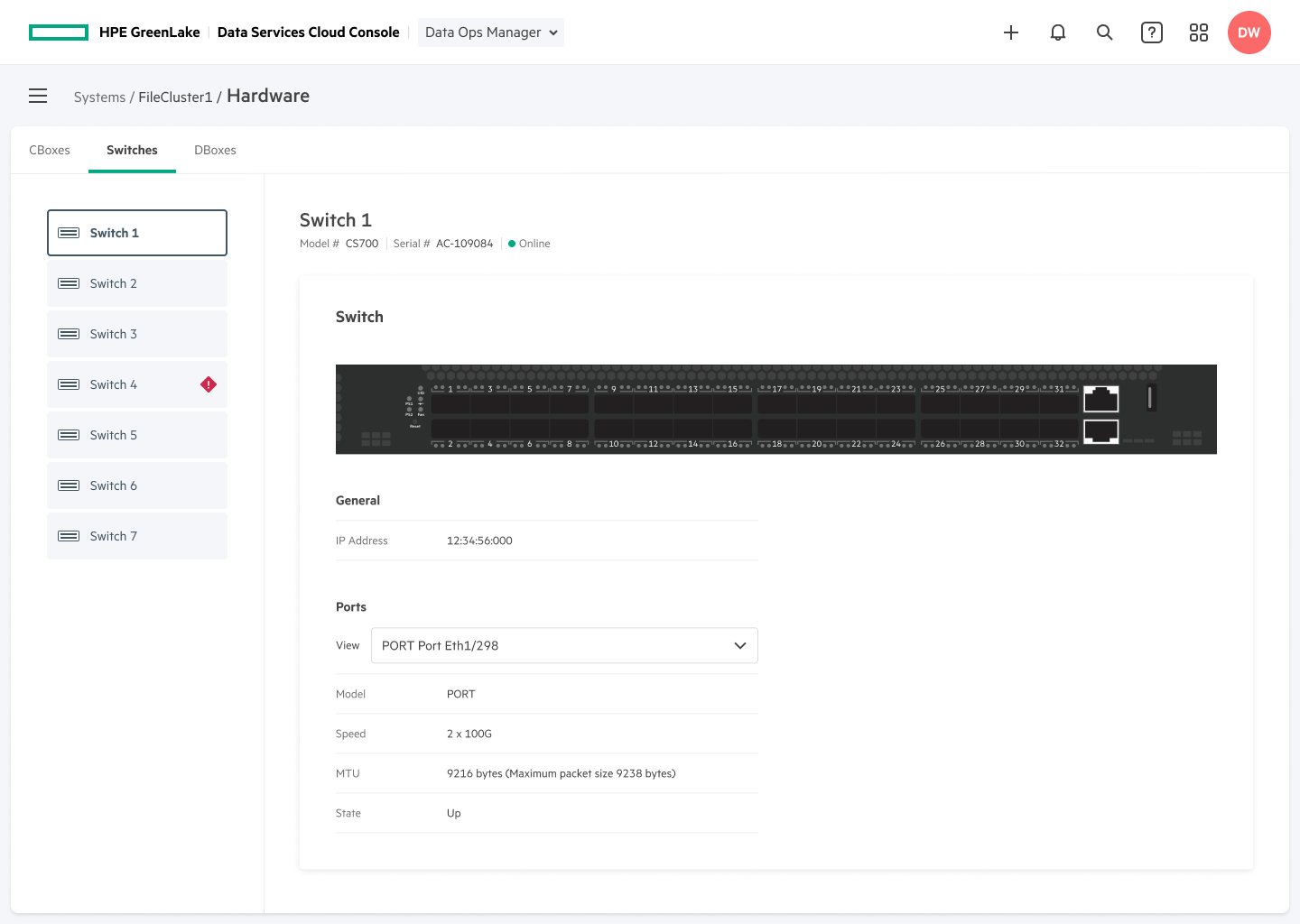
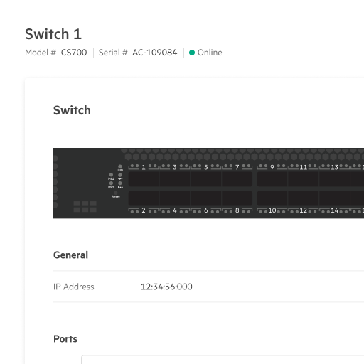
When a user digs deeper into a File Share they will be able to see all kind of information that clearly shows the exact details, security, usage, roles, and metrics. Users also have the option to view and interact with the hardware that manages their File Storage systems.
These highly relevant and intent-driven pages help users gain greater, granular details that are specific to each share or system. This helps in making informed decisions about how to manage and troubleshoot these items. You are able to quickly and easily gain the information you need without having to dig too deep while still keeping transparency in tact.


Non-marked version

Non-marked version
Problem Description
Enterprise applications must have confidentiality, integrity, and availability of shared data. These must haves are also concerns that require robust implementations and protocols to help manage your data efficiently. There is a strong need to make sure to prevent unauthorized access, data breaches, and cyber threats.
Systems, applications, and formats can create data compatibility issues. This could be a hinder to seamless sharing and collaboration. Enterprises must address these challenges through data standardization, integration, and transformation.
Vast amounts of data can come from various sources that make it difficult to handle data effectively.
Challenges
- Designing a seamless experience that doesn't compromise security
- Compatibility and compliance issues
- Need to clear policies, roles, and responsibilities
- Vast amounts of data from multiple sources
- Differentiate between internal and external sharing
Strategies
- Standardized data, integration, and transformation
- Create scalable and efficient data management
- Create consistency across systems, interactions, and applications
- Define clear policies, roles, and responsibilities
- Invest in scalable data management infrastructure
User & Groups Page Example
This Users & Groups page is a great example of how roles and management can be used effectively. I helped to design secure ways for users to be added, secured to a specific system, and only have access to what they are allowed to see, and use.
An administrator will be able to manage and see what each user is using and doing through an extensive management system that is easy to use. Users and groups can be attached to File Shares, Systems, Servers, and even Policies.
By having a standardized system with consistent interactions, integration and policies the users will be able to seamlessly and easily collaborate and share data.

Share Settings Example
The Share Settings page is a wonderful example of how policies, security, responsibilities, compliancy, and data can all efficiently work together.
This is also another example of the transparency that I helped to design into the system so that users have a robust policy to help protect their data. Policies can be easily created through a focused modal creation process, used for multiple files shares, and duplicated to create variations for specific needs.

FEEDBACK
Idan Zalzberg, CTO of Agoda says, "Agoda has always been about using the best technology for the task; to that end, the combination of HPE Greenlake with VAST Data Technology makes perfect sense and we look forward to seeing HPE Greenlake for File Storage deliver best-in-class performance for years to come."
"By combining VAST Data's next-generation architecture with trusted hybrid cloud infrastructure and data services from HPE, customers now get the best of all worlds combined into a single, simple to consume solution from HPE," said Renen Hallak, Co-Founder and CEO of VAST Data. "VAST is laying the foundation for the future of data management and AI workloads, and together with HPE, we're continuing to innovate for the enterprise, where data is at the center of every application strategy and business decision."
"HPE GreenLake for File Storage has a disaggregated, shared-everything, highly resilient modular architecture that allows to scale performance and capacity independently - and it's designed for exabyte scale. With all-NVMe speed for fast, predictable performance and no front-end caching, data movement between media, or tiered data pipelines, it can supercharge the most data-intensive AI applications." --CXOtoday.com
DESIGN IMPACT
- Sales
- Within the first two months:
- Owned by 40 large companies
- 30 million plus in sales
- Metrics
- One unified platform
- HPE Greenlake and VAST combination
- Exabyte!
CACI
Case Study
Programs
- Axure RP
- Adobe Photoshop
- Adobe Illustrator
Skills
- UX Design Thinking
- Research
- UI/UX Design
- Visual & Interaction
- Desktop, Tablet, Mobile
- HTML, CSS, JavaScript
CACI
Case Study
Programs
- Axure RP
- Adobe Photoshop
- Adobe Illustrator
Skills
- UX Design Thinking
- Research
- UI/UX Design
- Visual & Interaction
- Desktop, Tablet, Mobile
- HTML, CSS, JavaScript
PROJECT BACKGROUND
Project Goal
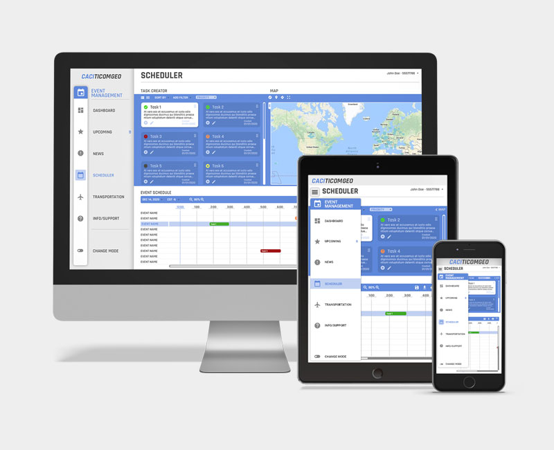
The client had been using bare-bones applications and manual filing to schedule important asset gaining events which includes capturing images, videos and/or learning specific details about an event.
Another problem was all the red-tape that went with those methods and the security that had to be upheld. Not only did they need UX design that was more human-centric and updated, they needed it to be faster, easier to read, smarter, smoother and above all else accurate!
Within the military the standard practices of getting information, getting it approved, and then getting it to the right people is an important and sometimes life or death matter.
Design Thinking
- Why do they need it?
- Who needs to use it?
- What are levels of security?
- What data needs to be accessed?
- Target devices?
- Target users?
- How many integrated programs?
- Best way to speed up process?
- Best design for dynamic use?
DISCOVERY
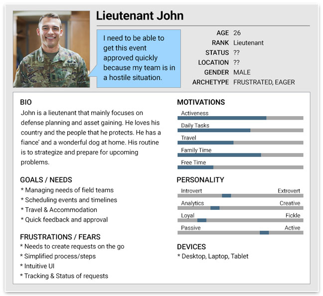
Persona Example
Research
- Interview different types of users.
- Keep in mind different tech levels, mental states, & ages.
- Get a clearer picture of what users are doing now.
- Figure out what works currently and what doesn’t.
- Look at similar products and possible incorporation.
- Determine what devices users will be using.
- Construct hypothesis, test, analyze & share data.
- Create interactive prototypes for more in-depth feedback.
- What sort of security do we need to include?
Preliminary Interviews
Participants
- Gender
- 2 Males
- 2 Females
- Age
- 36 years old
- 50 years old
- 26 years old
- 24 years old
- Ranks
- Captain
- Subject Matter Expert
- Lieutenant
- Seaman
Interview Summary
Different ages showed to have different skill level in the tech areas. They all agreed that the current methods were time consuming.
The Captain and the Lieutenant’s biggest needs was to be able to quickly see what he needed to approve, review, or deny without getting bogged down by tons of other data.
The Seaman said that organization and quick access to editing was greatly needed. The ability to see the status of the process. We also had to keep in mind the lighting situations because they had certain conditions that were reflected through the light color.
The Subject Matter Expert was more of an on-going interview throughout the entire development process. He was able to help with what it was like to be in the field and what would work and would not work.
IDEATION
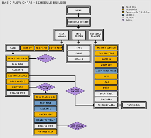
Task Flow Example
Hypothesize
- What sort of security is needed?
- What data & needs do they need access to?
- How will we speed up the process?
- Age, credentials, and tech experience?
Actionable Question
How might we create a secure, faster system and reliably deliver the right data?
Hypothesis Outcomes
We believe that a dynamic, responsive, and secure all inclusive application will achieve a faster opportunity for them to request, collect and approve events.
We believe allowing the users to login with their specific credentials will only give them access to what they need to see and thus speed up the information transference.
Specific Hypothesis: We believe that if we create a task system with a smart filter will allow users to quickly gain access to the most pertinent tasks and information they need to work on.
Possible Solutions
- Set up an encrypted back-end system.
- Display only needed information with the ability to view more and/or edit.
- Add high level security to allow for different logins with different priorities.
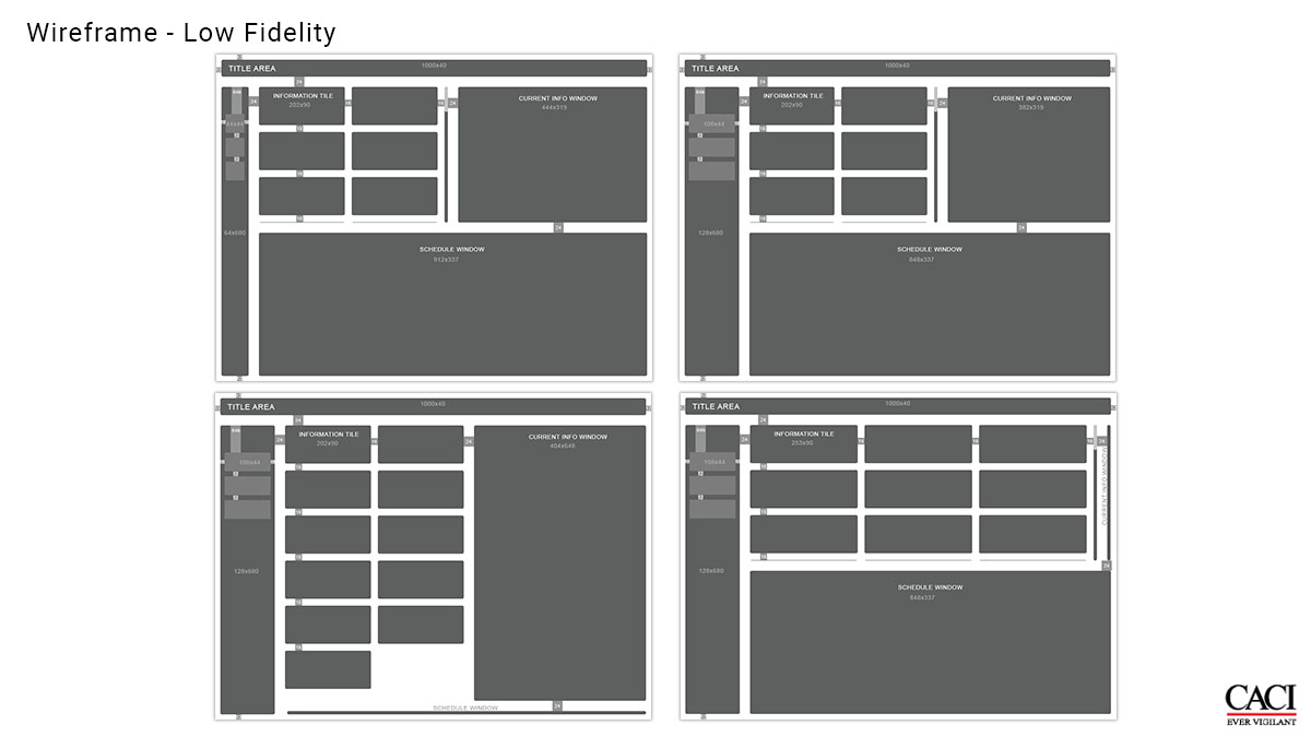
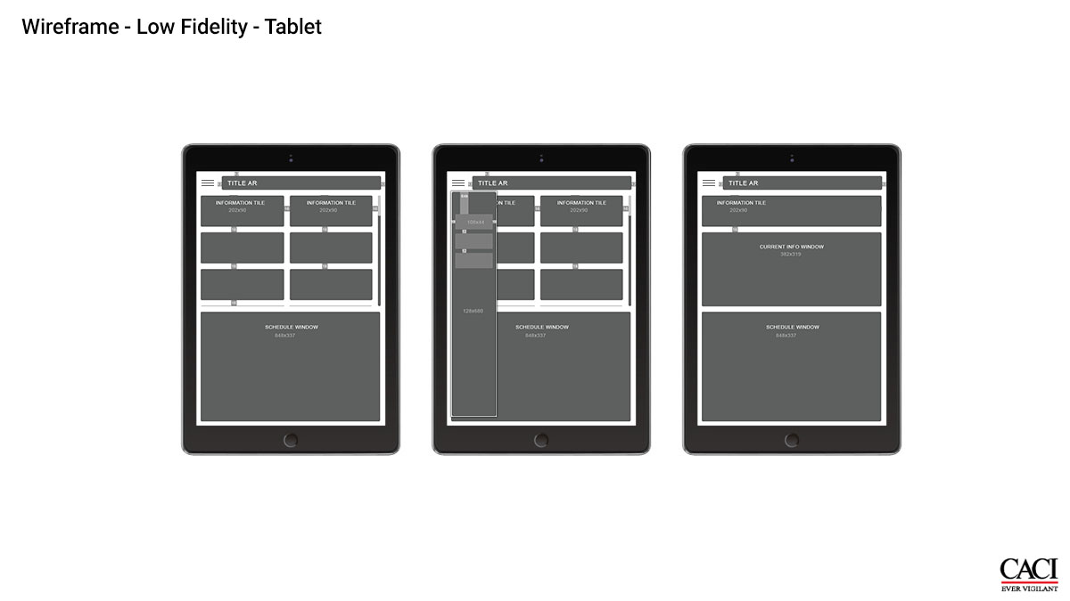
DESIGN
Responsive Applications
For the final project we were going to use a mixture of HTML, CSS, and JavaScript/React for the user-interface. Therefore I needed to keep this in mind, along with the user research, when creating the wireframes.
Through a number of user-focused interactive prototype iterations my team and I were able to come up with a scalable, dynamic, easy-to-use, smart system for user testing.
Participants
- In-house QA
- Two Seaman
- One Lieutenant
- Subject Matter Expert
User Testing
Before we finalized the design we needed to perform user testing with potential users. I created an interactive prototype through Axure RP.
Testing Goals
We were looking for comfort level, ease of switching from one application to another, understanding flow, recognition of icons, and speed.
Testing Questions
- Current methods and time spent on them.
- Evaluated current software and practices.
- Asked about specific tasks and program integrations needed.
- Asked if the new system felt more reliable.
- Gathered data on emotions, ease of use, comfort, and understanding.
Test Outcome
- Most icons were easy to understand.
- Praise for switching between applications.
- Difficulty in reading some of the text.
- 20% were confused at first.
- 35% said they wanted more information in tasks boxes.
- 70% had no trouble using the application.
- Sped up task completion by 65%
From Revisions to Finality
The final design of the program incorporated feedback from research, testing, and quantitative and qualitative iteration.
Using our Pattern Library, that was largely based on the Google Material Design assets, I designed is a simple modern theme. It incorporated responsive scaling and design for any device.
The iteration you see is just one of the many color themes and layouts a user can choose from due to the light change conditions. Thus the program would smartly adapt to those conditions.
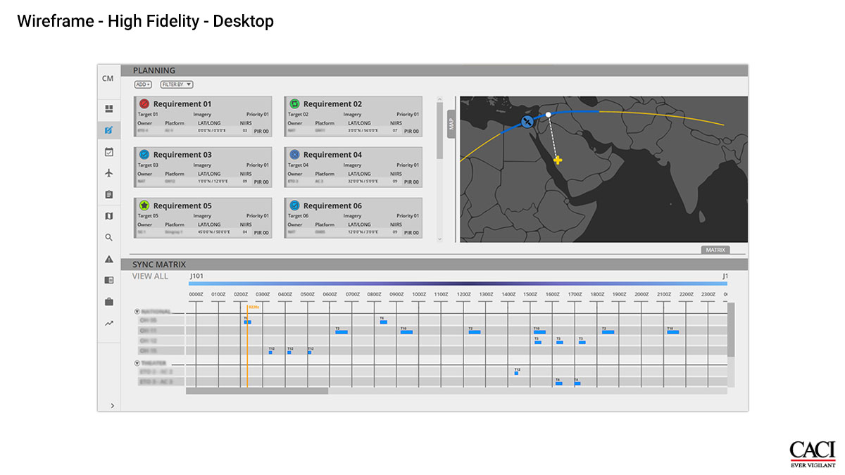
Example of Updates
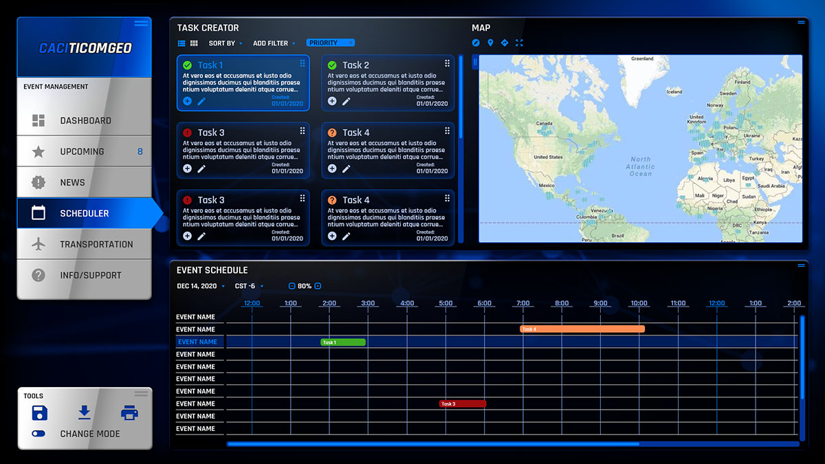
- Left nav allows for quick navigation through the different incorporated applications.
- The task grid allows for quick reference of the individual tasks with the ability to expand for more information or editing.
- The area allows for real-time view of the event location with estimated time and travel path.
- The schedule calendar allows for easy organization of tasks with pertinent information like vehicles, time, dates, overlaps, etc. You can even adjust for different time zones.
- Every section and application updates automatically whether through manual or drag and drop changes.
POST-MORTEM
What I Learned
The first question is, would I do anything different now? Of course! One thing I definitely learned is that UX Design never takes a break and is always humble enough to become better.
I definitely learned that good organization and effective interactive prototyping cuts down on development time and leaves more time for good UX analysis of the program itself. Never substitute personal preference for user needs and experiences.
Empathy.
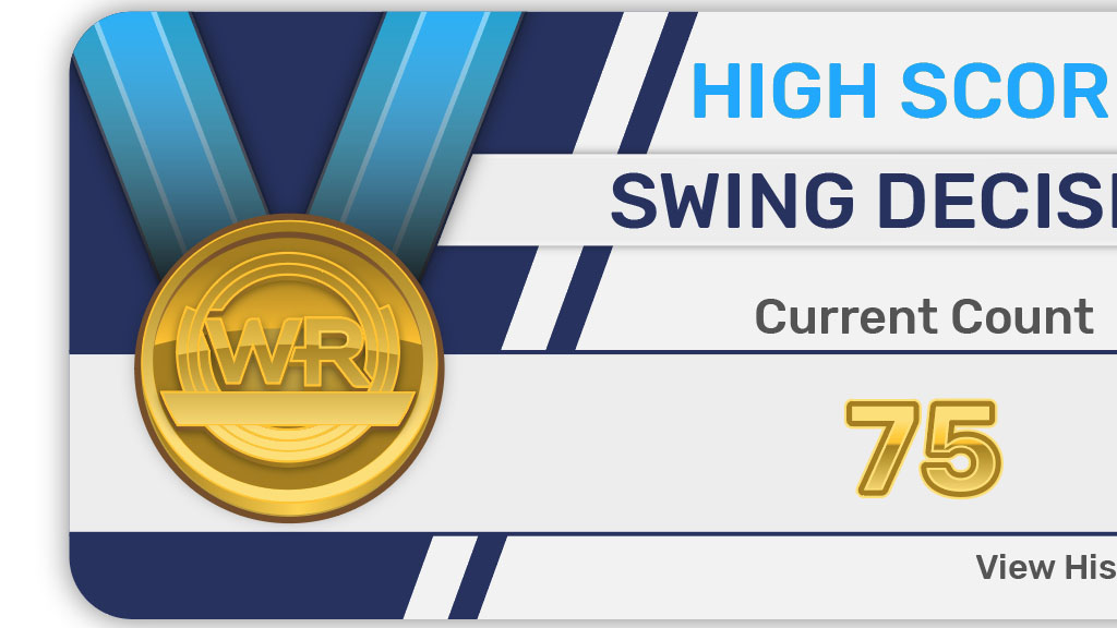
WIN REALITY
Case Study
Programs
- Figma
- Adobe Photoshop
- Visual Studio Code
Skills
- UX Design Thinking
- Research
- UI/UX Design
- Visual & Interaction
- Desktop, Tablet, Mobile
- HTML, CSS, JavaScript
WIN REALITY
Case Study
Programs
- Figma
- Adobe Photoshop
- Adobe Illustrator
Skills
- UX Design Thinking
- Research
- UI/UX Design
- Visual & Interaction
- Desktop, Tablet, Mobile
- HTML, CSS, JavaScript
PROJECT BACKGROUND
Project Goal
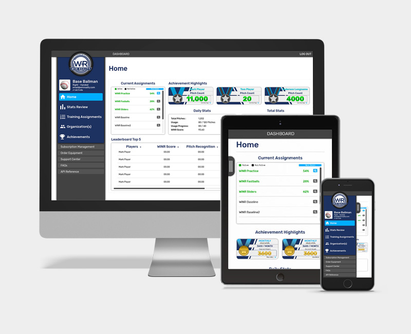
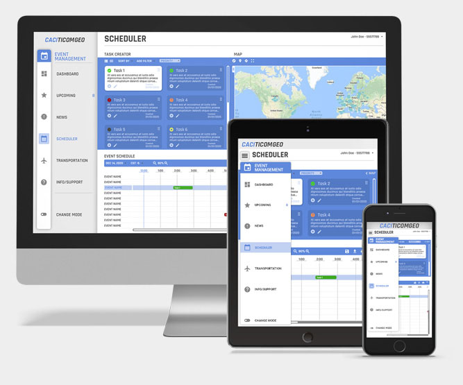
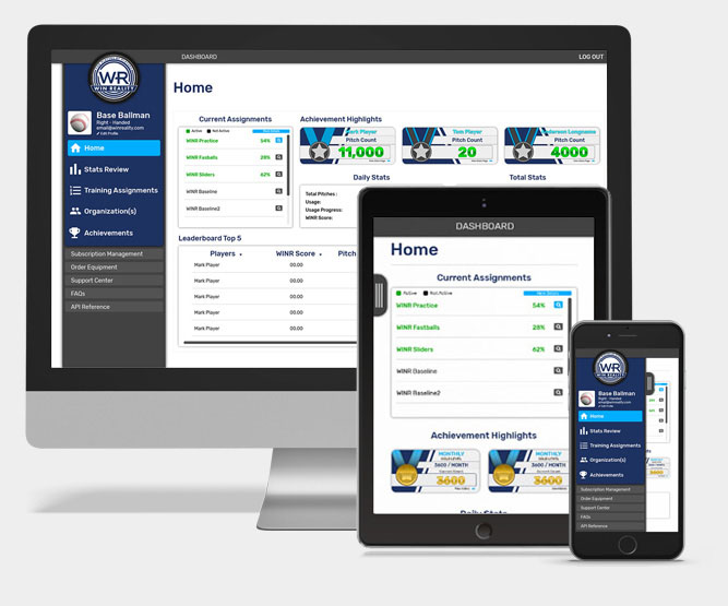
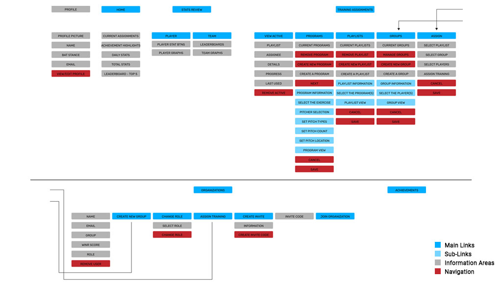
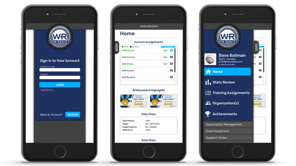
The goal was to create a more enjoyable and successful experience for the users. Win Reality was in need of a more streamlined web console for their VR professional baseball training system. The application needed to be able to be used on multiple devices and have a consistent feel across the board.
The target users were primarily coaches, managers, and trainers though players could also use the application for personal training. The current site struggled with bad data hierarchy and not enough direction for the training setup, thus my main focus was to create an easy to use, linear, and user-focused journey.
The objective of the application was for the aforementioned users to be able to set up training sets for their players, quickly access the training and information they need, communication, and to be able to receive accurate feedback.
Design Thinking
- Why do they need it?
- Who needs to use it?
- How many training scenarios?
- What data needs to be accessed?
- Target devices?
- Target users?
- Best way to organize data?
- Best way to work with VR system?
DISCOVERY
Persona Example
Research
- Interview different types of users.
- Keep in mind different tech levels, mental states, & ages.
- Get a clear view of specific training needs.
- Figure out what works currently and what doesn’t.
- Look at similar products and possible incorporation.
- Determine what devices they will be using.
- Construct hypothesis, test, analyze & share data.
- Create interactive prototypes for more in-depth feedback.
- What is the most valuable way for data communication?
Preliminary Interviews
Participants
- Gender
- 3 Males
- Age
- 54 years old
- 50 years old
- 28 years old
- Positions
- Manager
- Training Coach
- First Baseman
Interview Summary
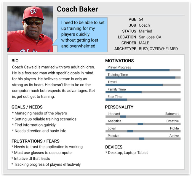
As with most cases, different ages showed to have different skill level in the tech areas. The Manager and the Training Coach both agreed that being able to quickly and easily set up a training scenario was the most important.
The Training Coach said that access to progress that was informative and straight-forward was second on his list. The First Base player was really excited about quickly getting into his training and comparing himself to the other players.
IDEATION
Task Flow Example
Hypothesize
- What would be the best layout for the user journey?
- Need to create the training setup to be linear.
- Prioritize data architecture for easy to find information.
- Ability to login with different credentials.
- Quickly access training, progress and communication.
Actionable Question
How might we create a web console that reliably communicates with the VR system that allows for quick access to information and setup?
Hypothesis Outcomes
We believe that a dynamic web console that allows for users to login with different credentials will allow them to only access pertinent applications.
Having a data hierarchy that places most used tools in the top section which will allow for quick, easy to use access.
Organize the data areas in windowed, scalable areas for easy to read information. Create the visuals in a complimentary, simple design that allows the information to stand out yet feel professional.
Possible Solutions
- Set up a menu that puts the most used tools as priority.
- Create training setup to be a linear path (bread-crumb) application.
- Information needs to be organized in easy to read/obvious sections.
DESIGN
Responsive Applications
The overall design of the web console was created to dynamically adjust to different devices. The design was created to be consistent visually and usability wise so that users would always understand what they were doing.
We created the application using a mixture of HTML, CSS, and JavaScript.
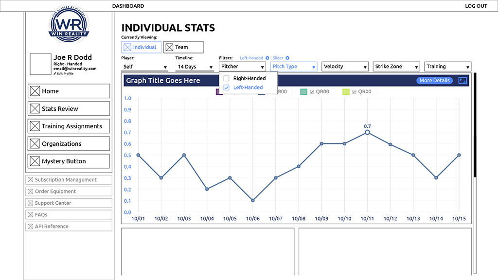
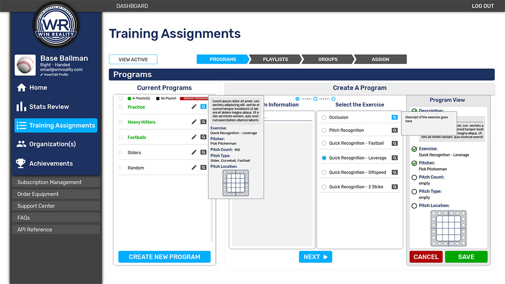
Data Science was used to provide accurate progress feedback as well as accurate training scenarios. Information for each section was created in separate data windows that allowed for easy scaling and adjusting with device types.
Participants
- In-house QA
- One Manager
- One Training Coach
- One Player
User Testing
To test the program I created a basic web console through Figma, but also an interactive one through Visual Studio Code.
The different phases of this prototyping allowed for an iterative study of how the console would work and allowed the testers to give accurate feedback.
Testing Goals
We were looking for the ability to find the right tool easily and with comfort. We watched for the level of understanding what they were supposed to do and if they could accomplish their tasks effectively.
We measured stress levels as well as the different patterns users would use to get where they needed to go.
Testing Questions
- Most important part of training?
- Are they able to find the training they need easily?
- Is there anything that doesn’t make sense?
- Were you successful in creating a new training scenario?
- Gathered data on emotions, ease of use, comfort, and understanding.
Test Outcome
- Main tools were easy to locate.
- Praise for data being easy to read.
- Difficulty in knowing where to add new players.
- 15% were unsure of training setup.
- 30% felt there wasn’t enough data feedback.
- 80% had no issues.
- Tasks that averaged 5 minutes now took 2 minutes.

From Revisions to Finality
The final design was created as a modern, sleek application with a sporty feel. I incorporated everything that I learned from the research, testing, prototypes, and feedback.
We were able to create a consistent and effective pattern library, as well as a standardized style guide. We established a better organized data hierarchy that directed the users to find the most valuable needs first.
The visual design and flow was loosely based on the Google Material design and branding from the companies other products.
The quantitative and qualitative results helped us to understand the patterns and needs, to which we were able to create a more successful user journey.

Example of Updates
- Main navigation was created with most important tools in the top section with larger visual hierarchy to draw the eye.
- Text size was created a bit larger than normal because of the majority of the users being older.
- All of the data was organized into scalable windows of information that helped users not get lost or confused.
- Simple, modern layout helped with readability and ease of use.
- Everything had it's place and was designed in a way that you always know where you are.
- Information was given in digestible bites with the ability to show more detailed info when needed.
POST-MORTEM
What I Learned
The big factors in this project were patience and empathy. Age, experience, and needs create a huge complex challenge that makes it hard to please everyone. I learned to deal with the challenge by focusing on the roots of the main needs. This allowed me to find the best balance I could for the design.
By creating the training setup with linear direction this helped users quickly create their training scenarios and easily find the information they needed. This was especially helpful for the major age group being in the older section.
Specific organization and better data hierarchy helped to speed up the training creation process and helped to create successful user journeys.
Title Area
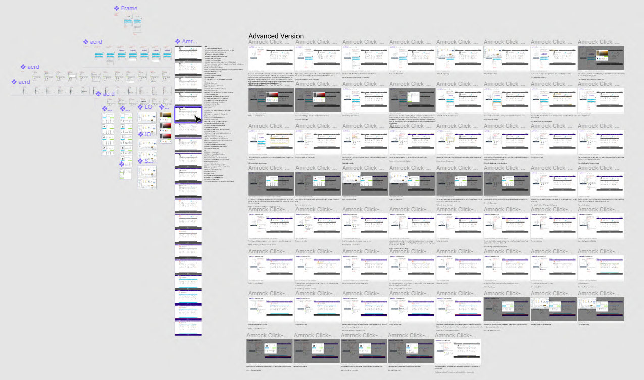
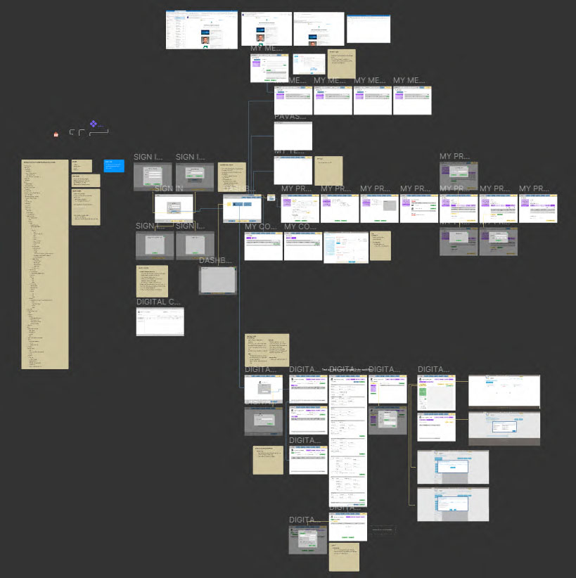
Click the images to view them up-close!
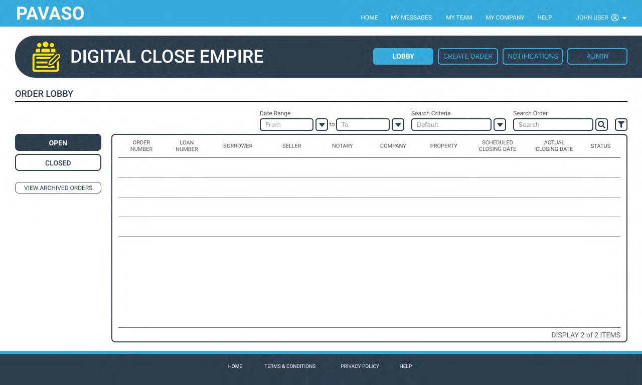
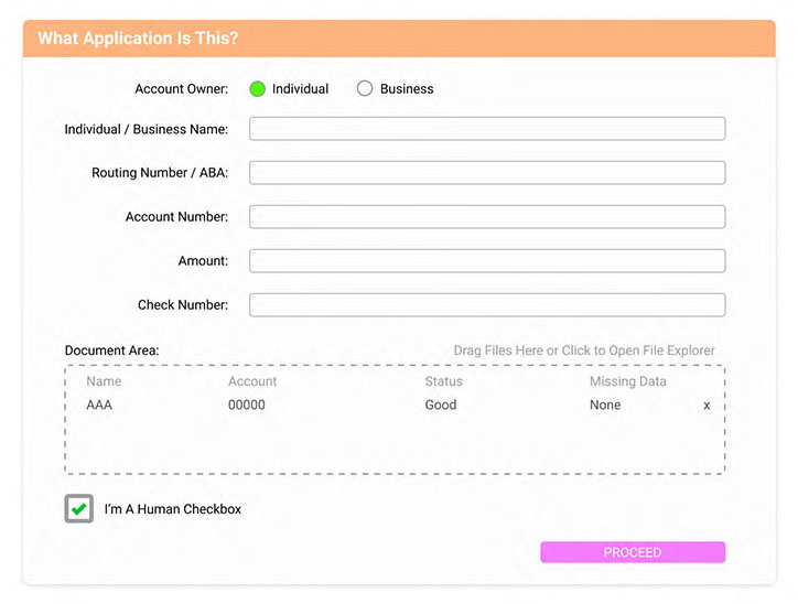
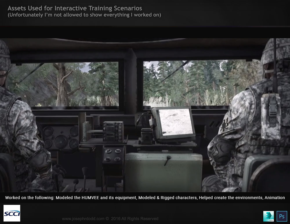
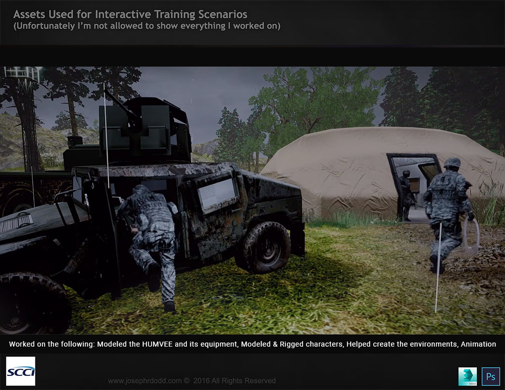
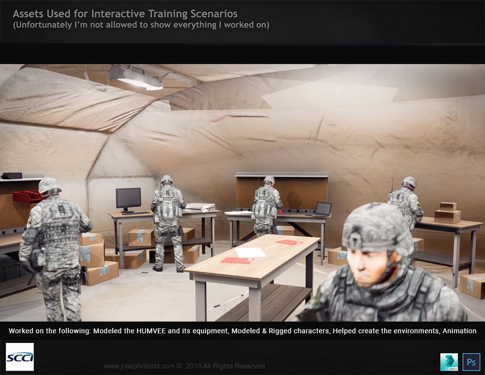
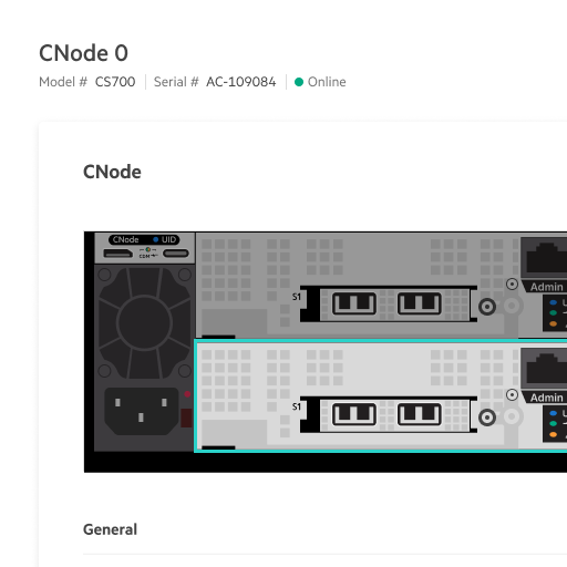
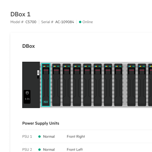
For Storage Fabric Management, I was the owner Senior Interactive Designer. Storage Fabric Management allows for cloud-as-a-service to help manage your Fibre Channel storage environment. It uses auto-deployment, simplified SAN management, seamless configuration, resiliency for reducing deployment time, single pane of glass, manage multiple domains, end-to-end provisioning, diagnostics and monitoring. All of this through an intuitive, and simple to use interface.


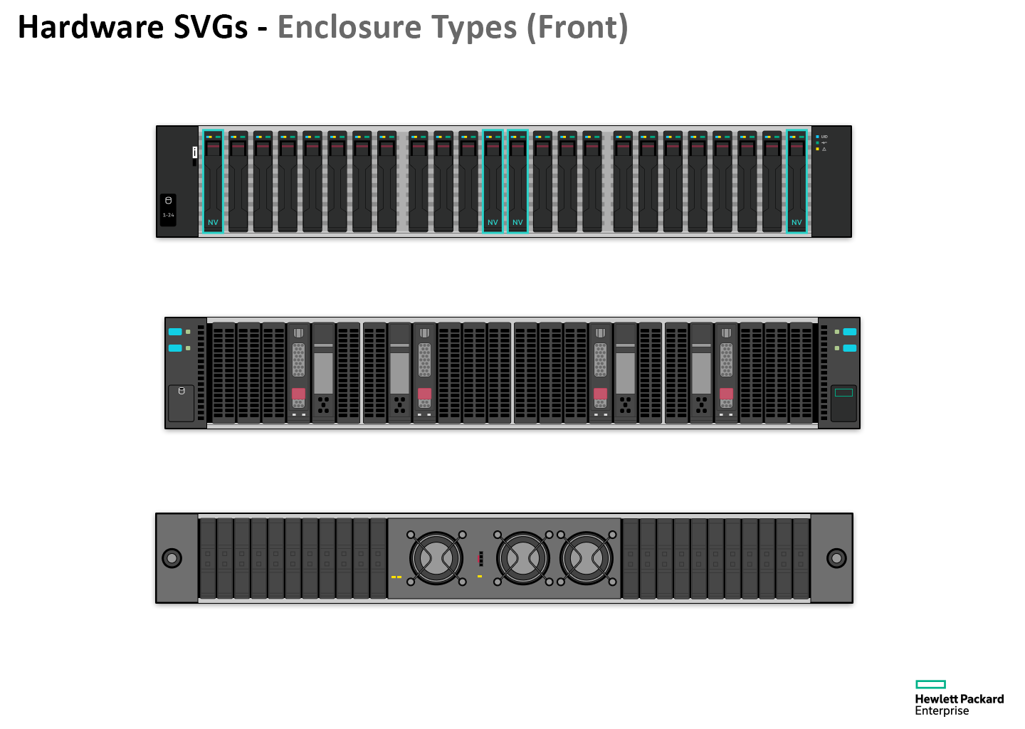
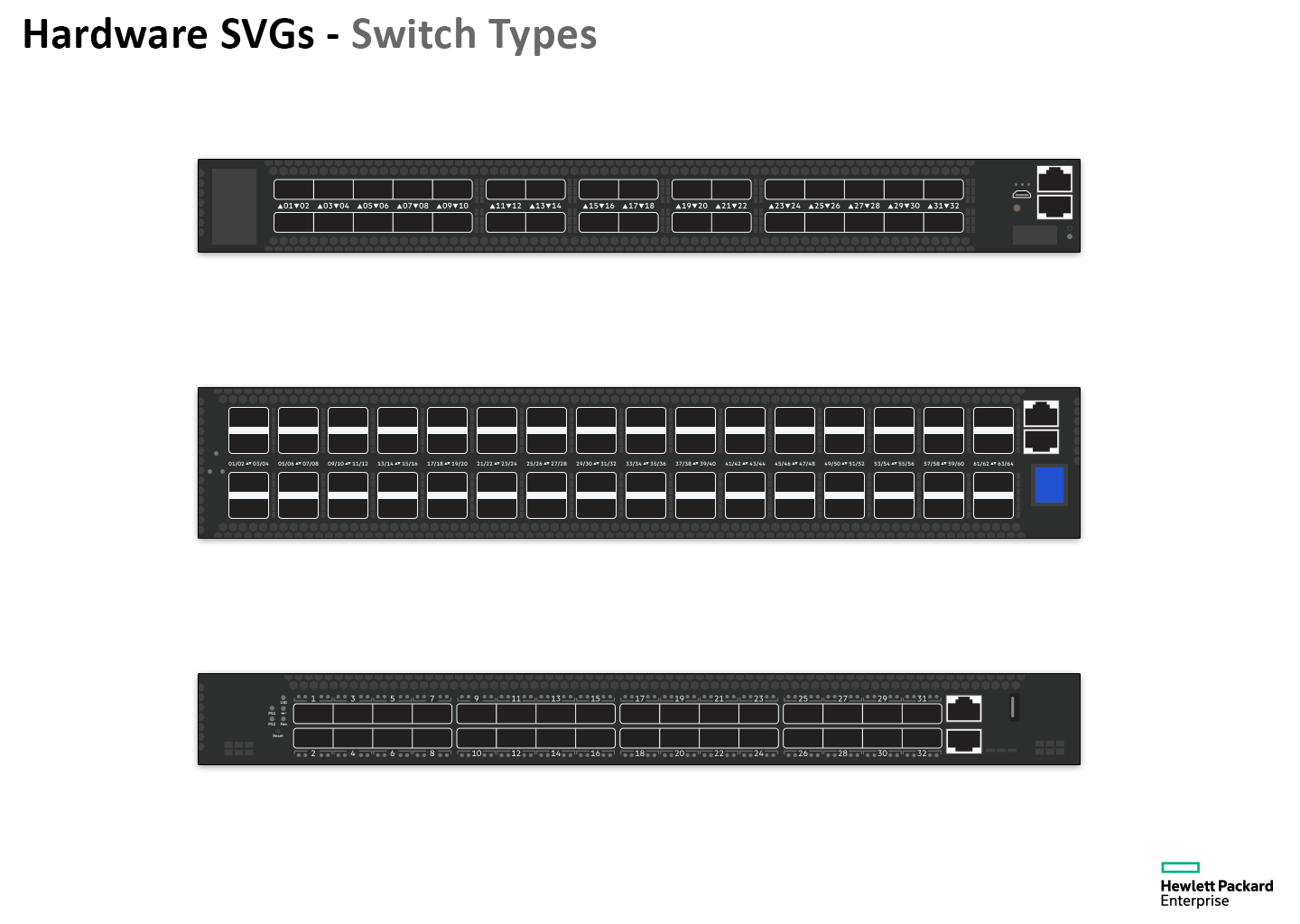
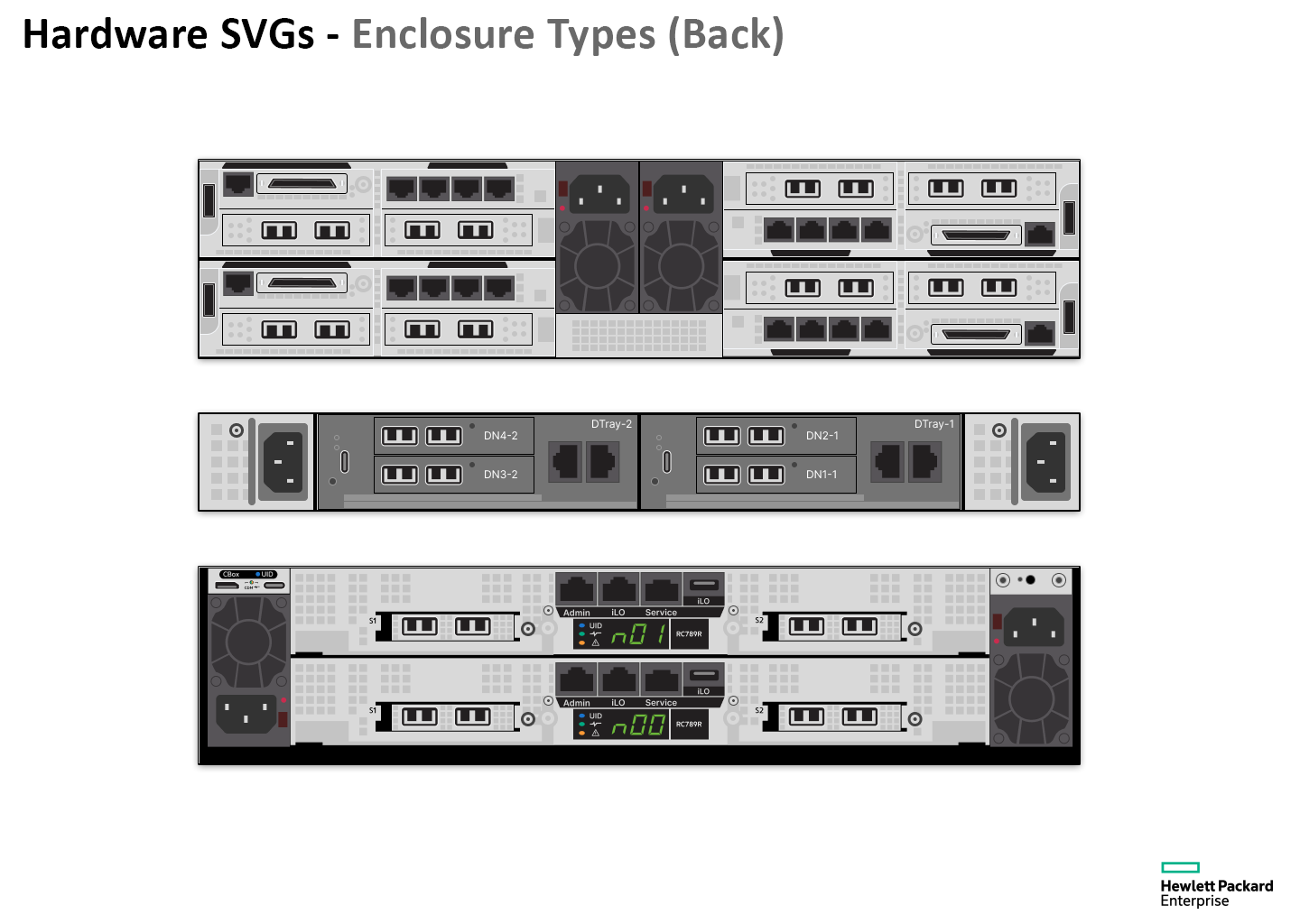
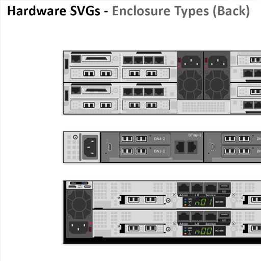
This sustainability work is an exploration of an up and coming feature for HPE Greenlake Storage. This work is a collaboration with my UX team that I eventually helped to lead.


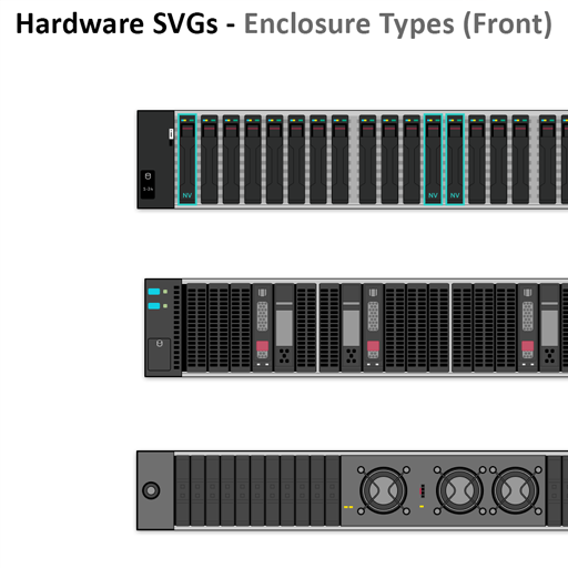
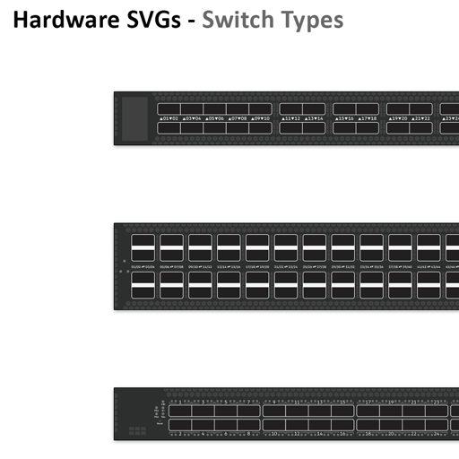
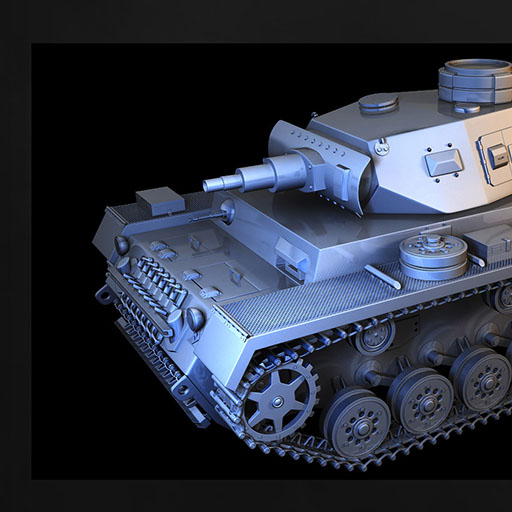
The images below are vector/svgs that I created of hardware types that are being used by HPE Storage. The goal was to create them in a way that helped the important areas stand out, to be able to scale dynamically, to be easier on the eyes and allow for interactive immersion.


My primary goal in my professional journey is to turn complexity into possibility, driven by a deep desire to simplify and improve lives. I earned a Bachelor's of Science degree in Interaction and Visual Design, and continued my education through the Interactive Design Foundation. My skill set encompasses narrative user experience, interactive prototyping, effective wireframing, traditional art, visual design, illustration, 3D design, and storytelling. This diverse background contributes to my creative and intuitive design approach, particularly in enterprise-level design, SaaS, and B2B environments. I have experience designing for various platforms such as desktop, web, and mobile devices, utilizing tools like Adobe Creative Suite, Figma, InVision, 3Ds Max, Visual Code, along with proficiency in HTML, CSS, and JavaScript. Feel free to explore some of my work, and please reach out if you resonate with my approach. Thank you for visiting!

My Skills
- Designs UI/UX in corporate, and startup environments
- Experience in managing business objectives
- Able to work with consumer brand communication
- Conducts and interprets market research
- Manages and performs usability testing
- Cross-team collaboration.
- User research and usability testing
- Helps design and create forward thinking user interfaces
- Helps improve user experiences
- Solves UX and visual design challenges
- Always keeps company and user guidelines in mind
- Able to design for multiple platforms
- Able to work under pressure
- Thrives in fast-paced work environment
- Maintains high quality results
- Solid grounding UI/UX design
- Also skilled in traditional art, 2D/3D art and modeling
- Versatility to quickly adapt to different art styles
- Bachelor of Science with a heavy emphasis on Interaction Design
My Core UX Principles
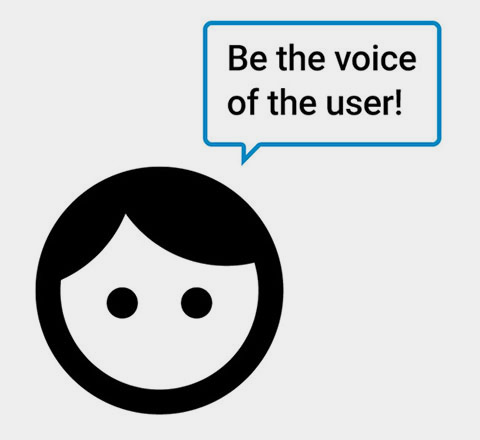
- Be the Voice of the User!
- “Why are we building this?”
- Develop a Plan and a Process
- Stay Usable, Consistent
- Understandable & Accessible
- Focus on MVP, Consider Nice to Haves
- Study User Patterns
- Keep User Journey Understandable
- Visual Grammar & Personality
- Feedback Matters
My Process
This is just a generalized example of how I think.
- Who, What, Why, When, How?
- Data and Insight
- Any available metrics?
- Verify and sign off on process with team
- Any preliminary research?
- Research Competition and Similar Products
- Define User/Company/Branding Needs
- Problem Statements
- Hypothesis
- Outline MVP and Key Features
- Whiteboards are fun!
- Make a Plan
- Work Closely with Developers
- Personas, User Stories and Journeys
- Draft Framework and Architecture
- Design in Digestible Bites.
- Start Simple, Add As You Go
- Prototype Features and Testing
- Iterate, Iterate, Iterate
- Feedback, Feedback, Feedback
- Deliver and Finalize
Discovery
Ideation
Design